Clients:
Gu Society - Cafe & Mini Mart
Services:
Brand Strategy
Visual Identity
Print
Year:
2024
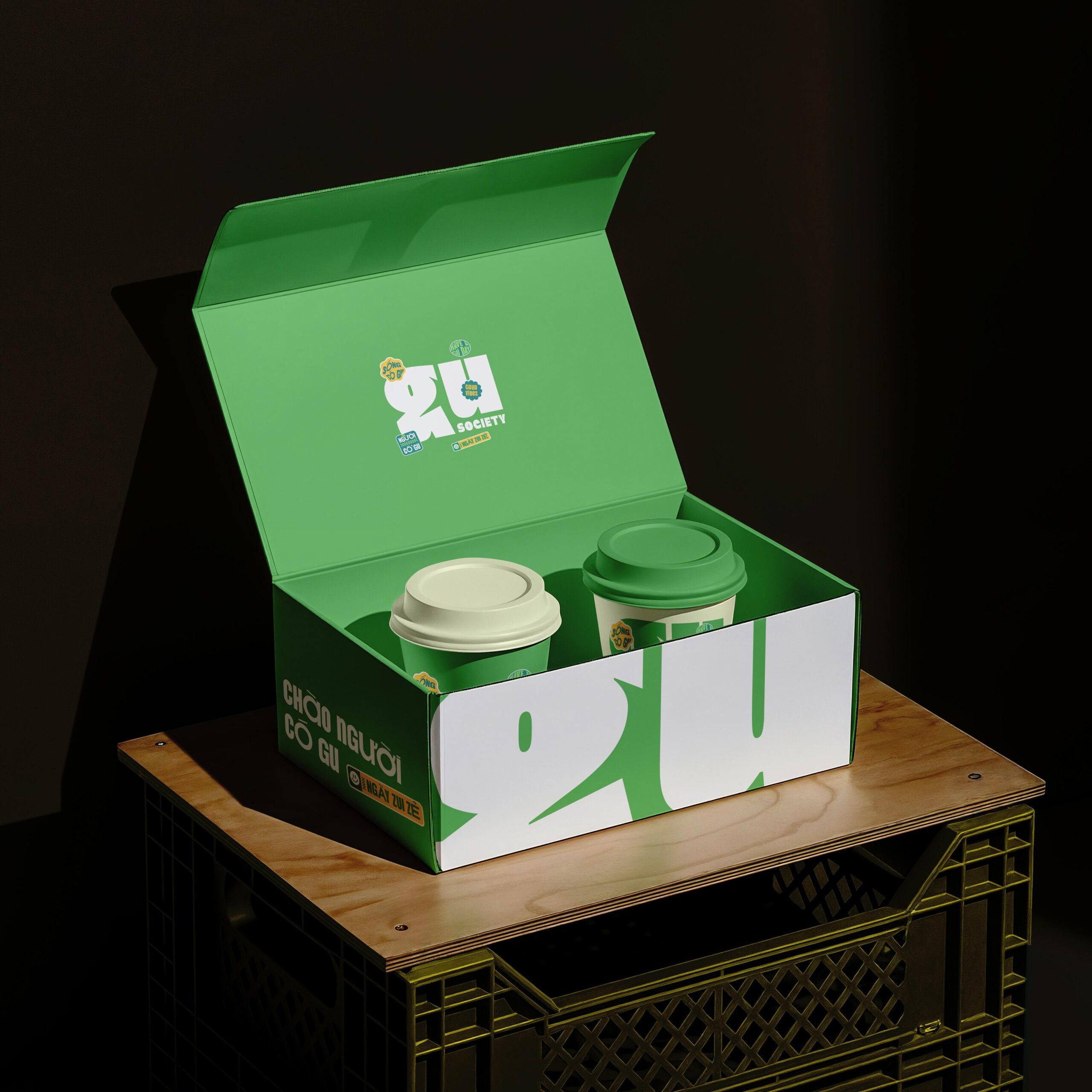
Gu Society is a vibrant café and minimart brand designed for the young and the young-at-heart. The logo concept captures the brand’s playful spirit and energetic vibe through a bold, modern typeface. The brand name itself becomes the central shape of the logo, with a cheekily stylized “G” that adds a whimsical twist. The remaining characters are rounded and thick, radiating a sense of fullness and vitality. This contrast between the quirky “G” and the solid, energetic letterforms enhances visual impact and ensures the logo stands out within any graphic composition.
The overall identity evokes a carefree, joyful, and youthful atmosphere - infused with a touch of dreamy nostalgia. Inspired by the hippie design trends of the 70s and 80s, the visual language bursts with color and character, while maintaining the professionalism and sophistication expected of a modern lifestyle brand.
Gu Society’s branding balances fun and finesse, creating a visual experience that feels like stepping into a world of color, creativity, and community.