
Clients:
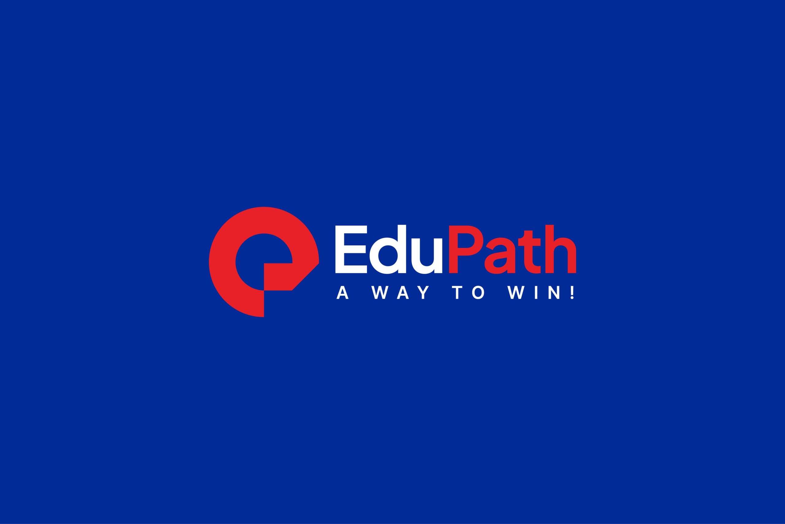
Edu Path - Study Abroad Consultant
Scope:
Brand Strategy
Visual Identity
Year:
2023
With nearly 15 years of experience guiding Vietnamese individuals in studying abroad, tourism, and immigration, EduPath is revamping its brand identity to reinforce its leadership position and reaffirm its mission: "Accompanying every Vietnamese in conquering their dreams beyond borders."
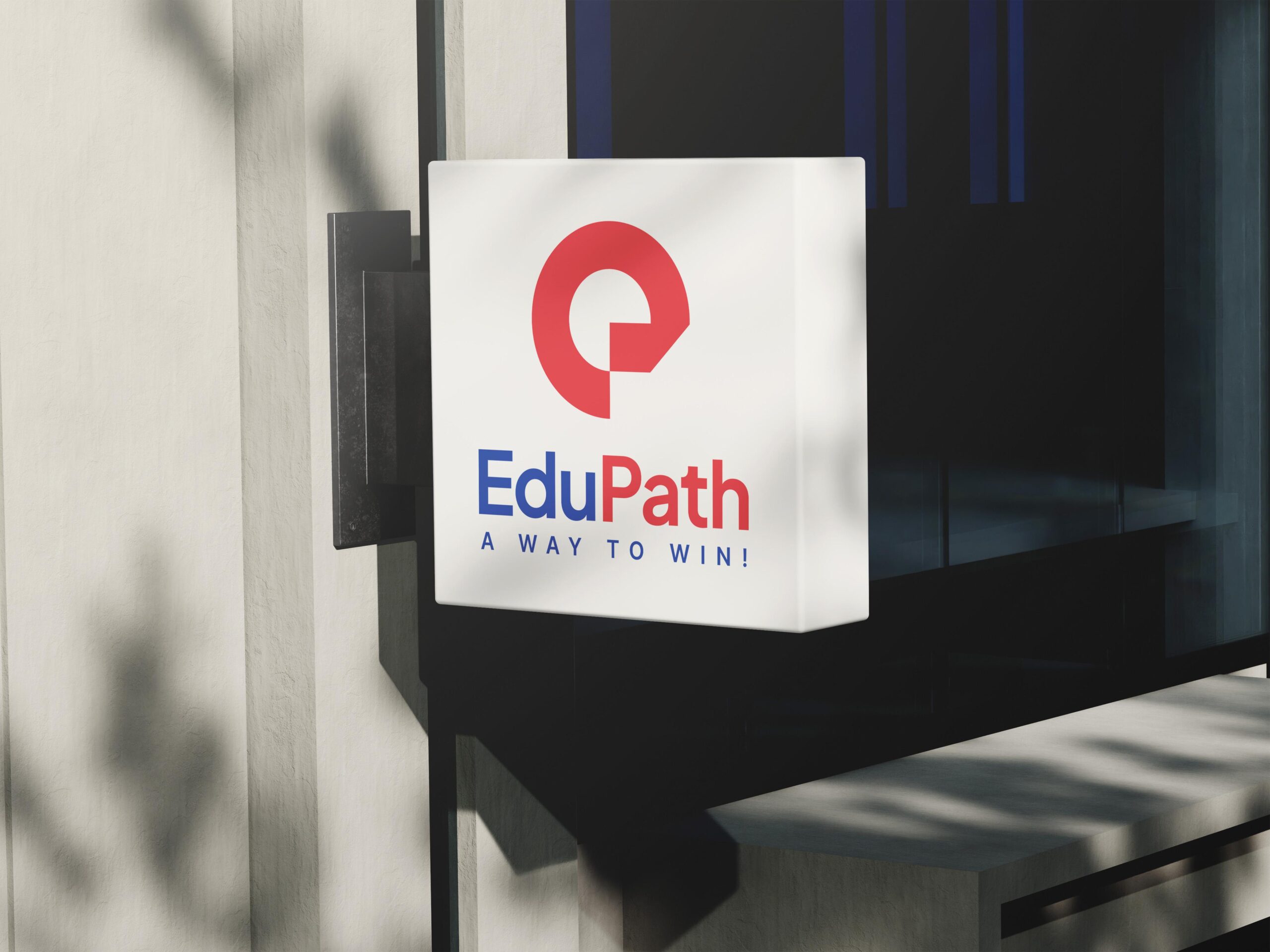
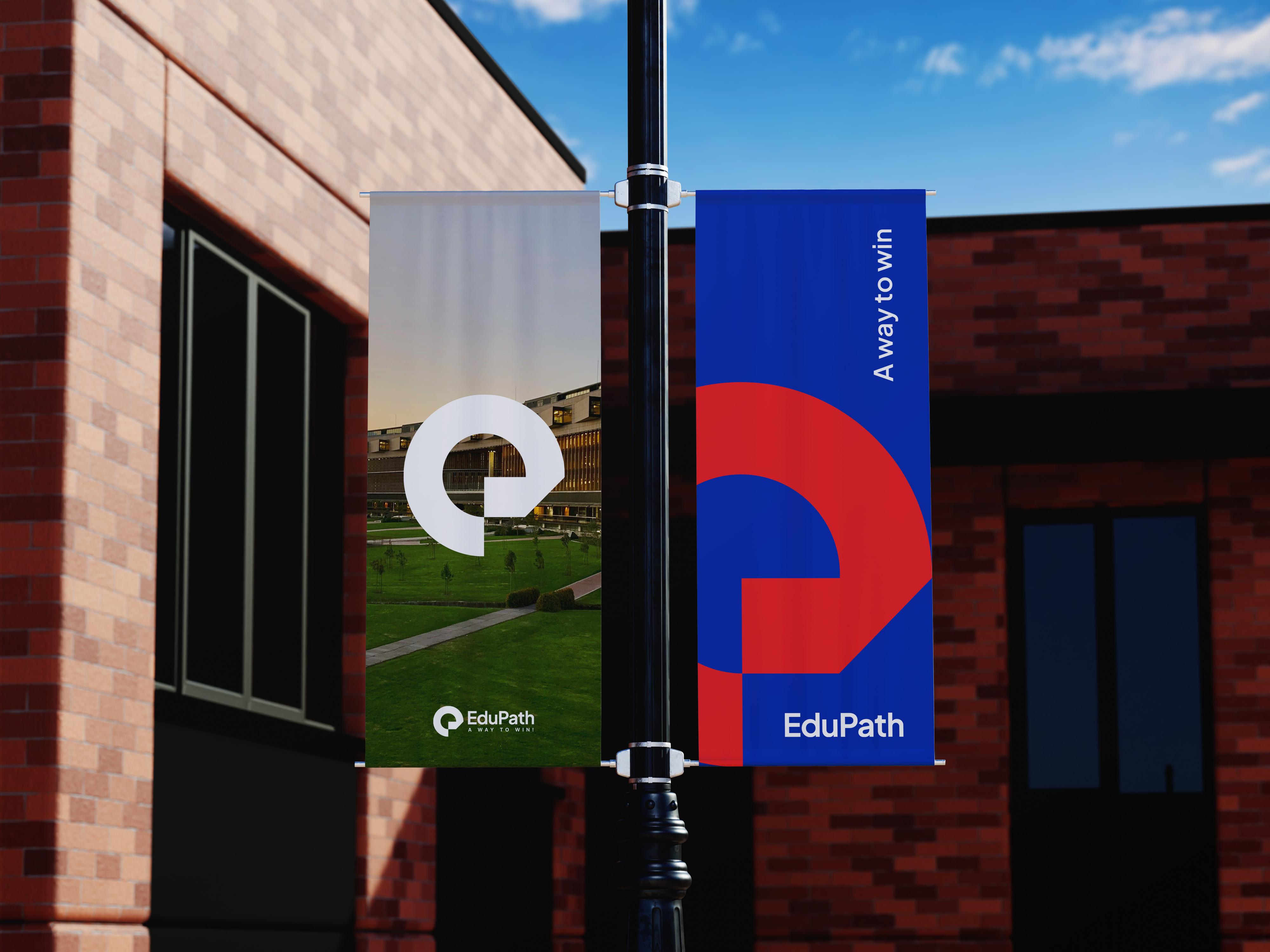
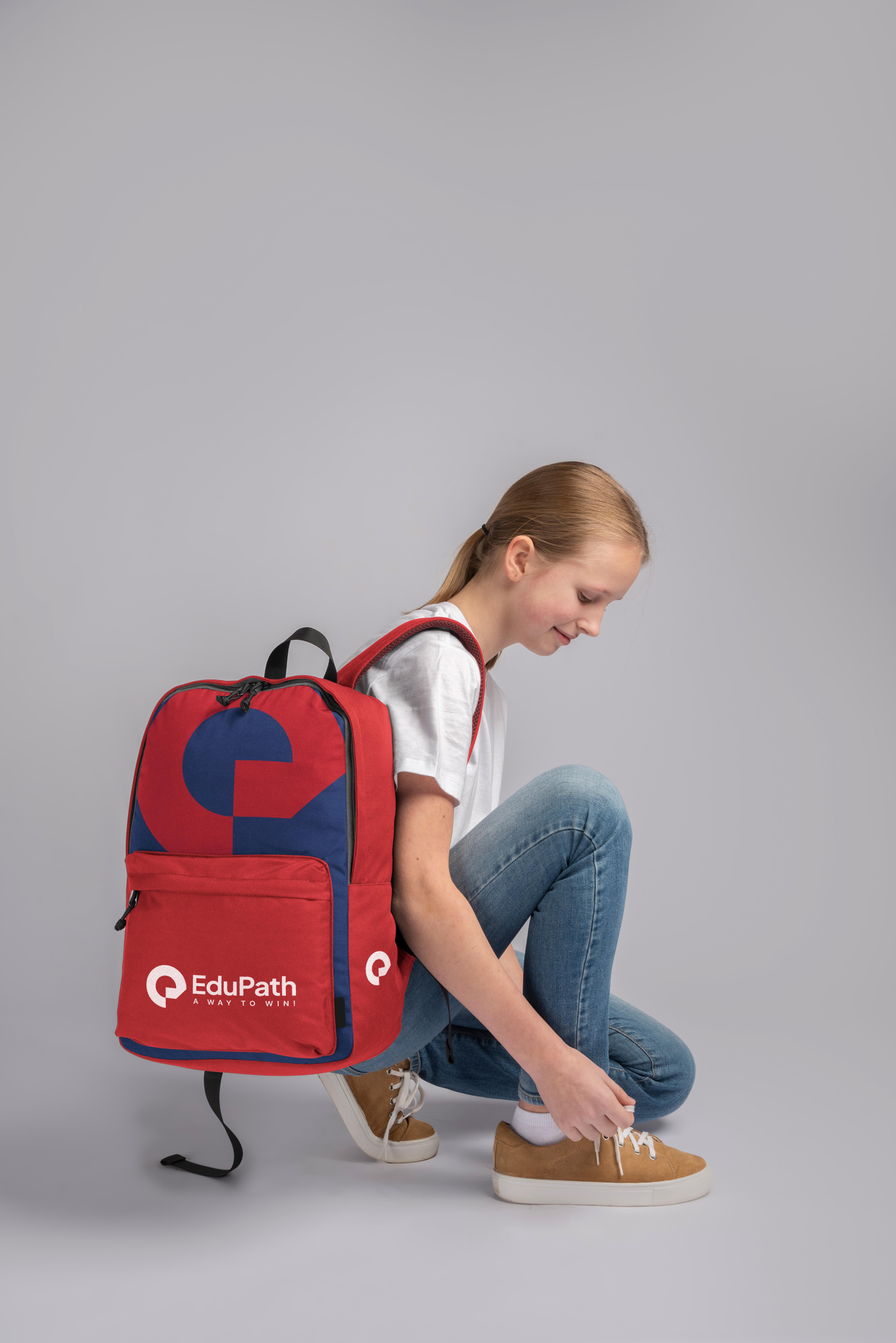
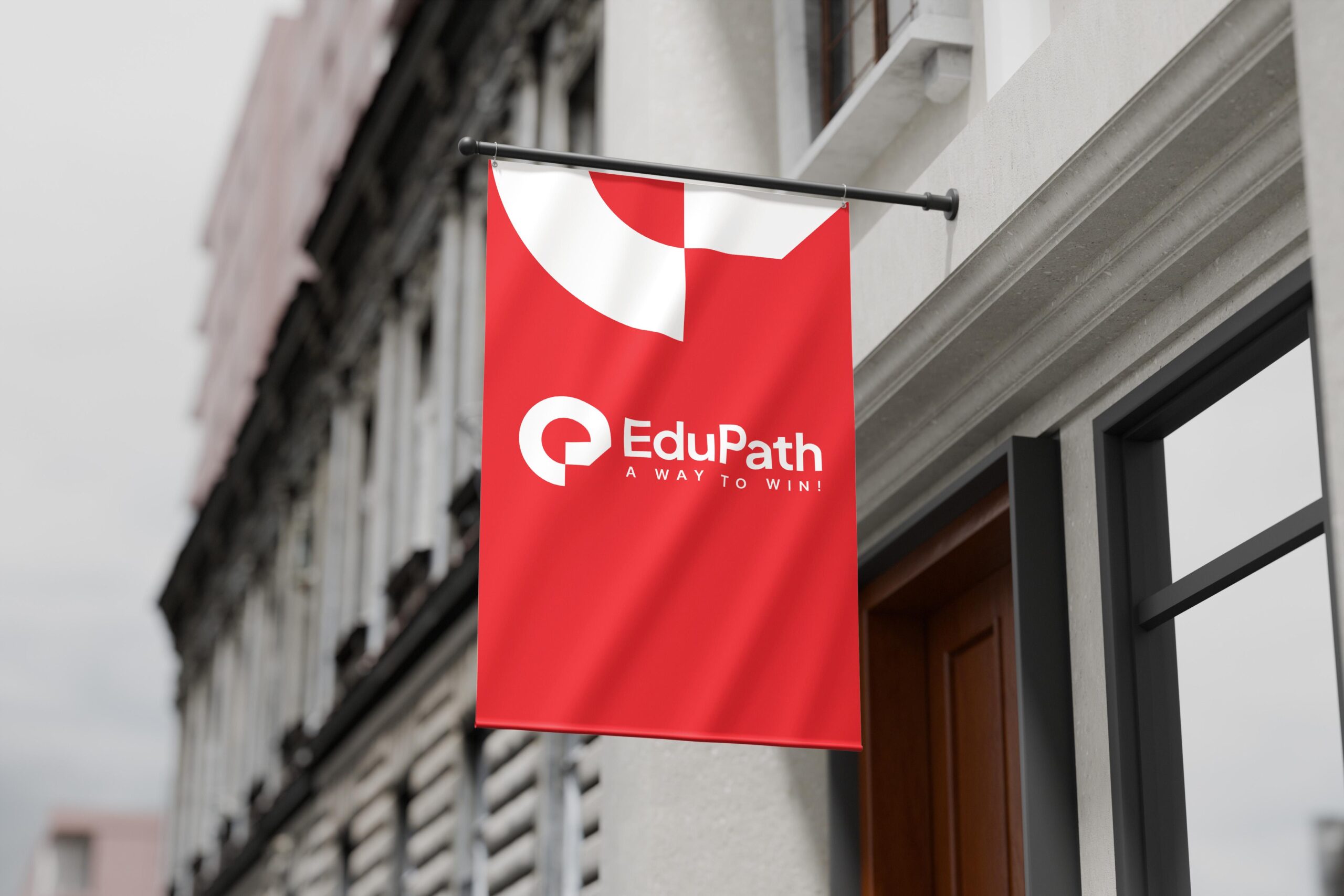
The new logo, inspired by the letter "e", adopts a minimalist design that symbolizes a strong and seamless pathway—representing EduPath’s role in providing clear direction and unwavering support.
This refreshed identity not only preserves EduPath’s legacy but also marks a new journey—a stronger, modern, and inspiring brand, ensuring customers feel confident as they embark on their global aspirations.
The brand color palette is centered around red, a color associated with passion, determination, and creativity—key attributes in the education sector. It is complemented by mid-blue, which introduces a balanced contrast, reinforcing the brand’s professional and contemporary image. This thoughtful combination strengthens brand recognition while staying true to EduPath’s core values: Credibility – Responsibility – Dedication – Effectiveness.
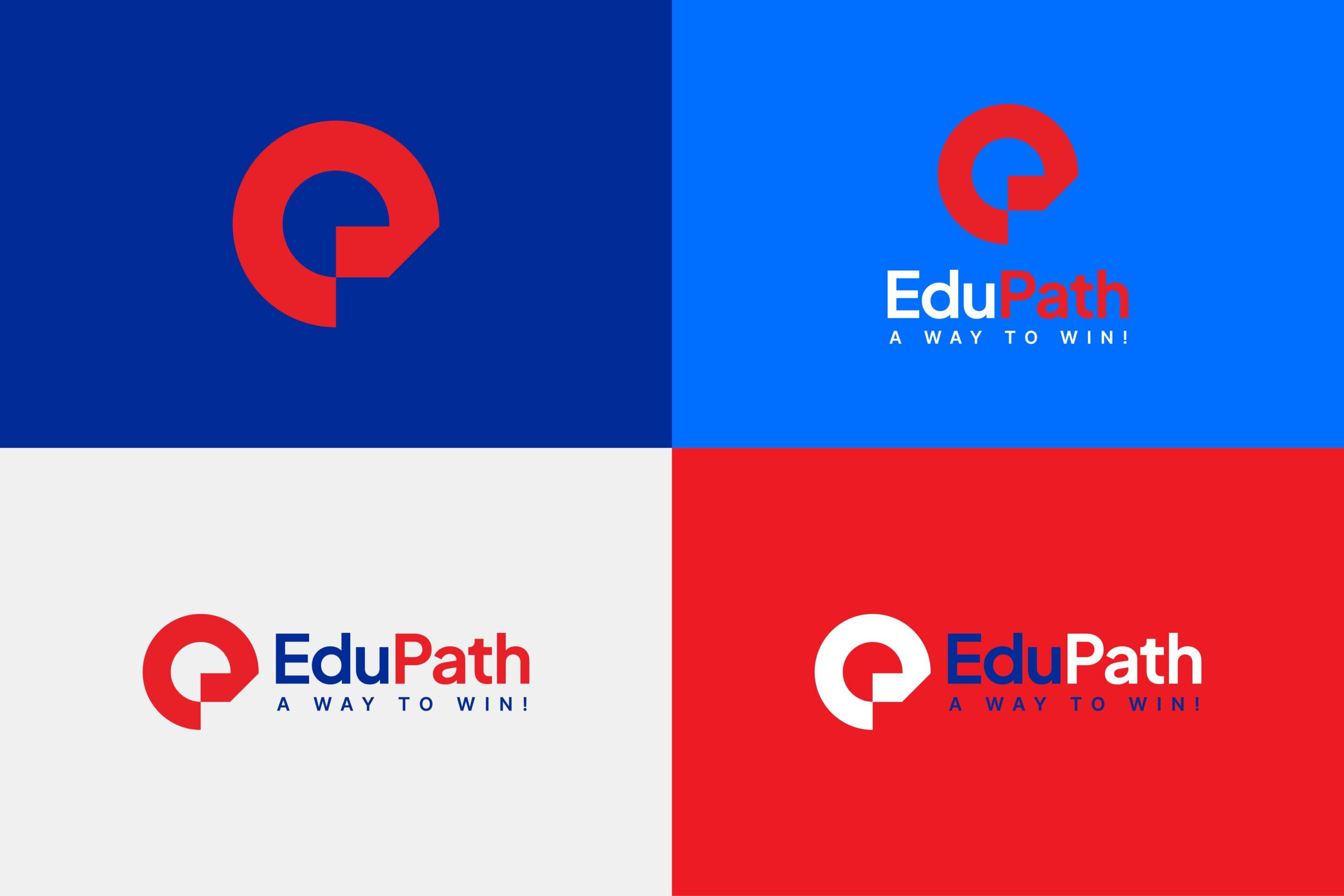
The Plus Jakarta Sans typeface, with its geometric balance, rounded yet sturdy letterforms, enhances the brand’s professionalism, reliability, and modern appeal.