
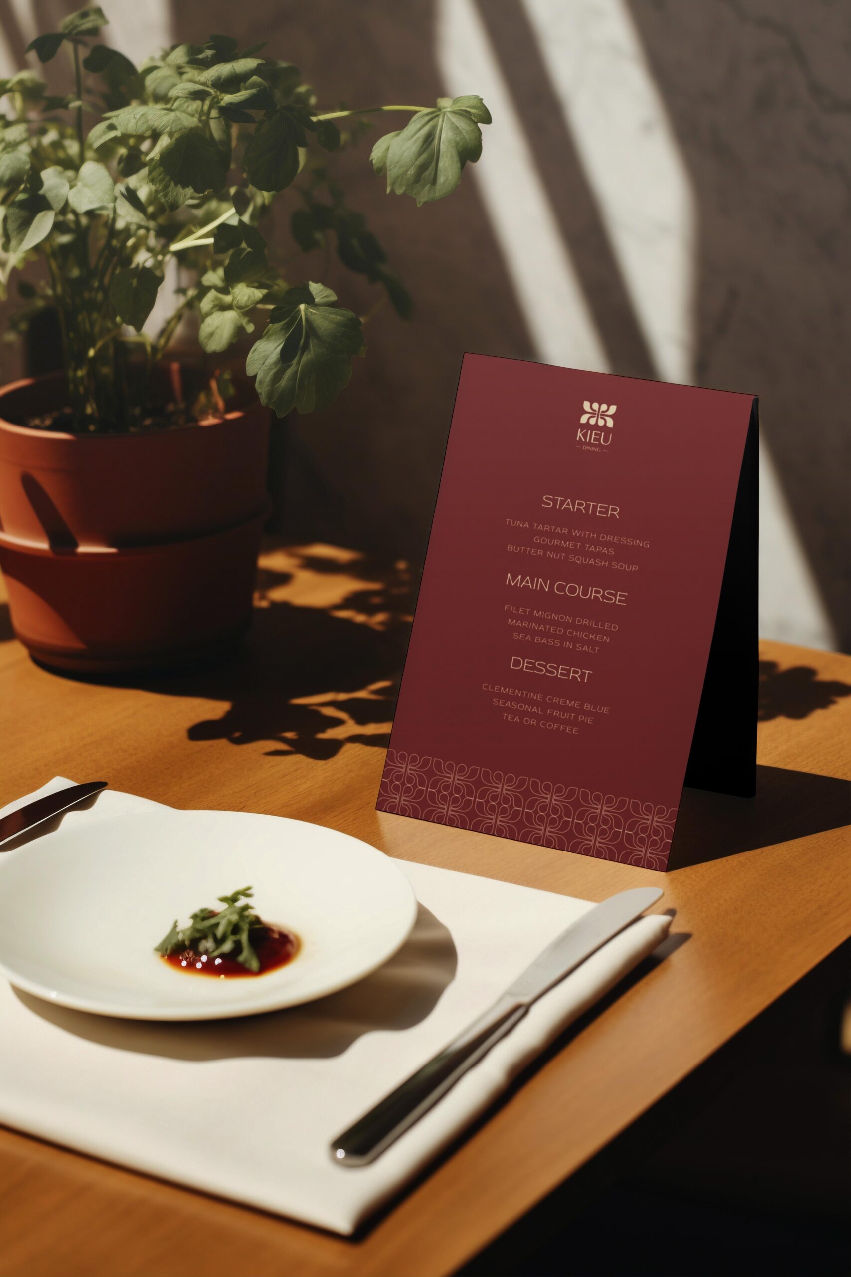
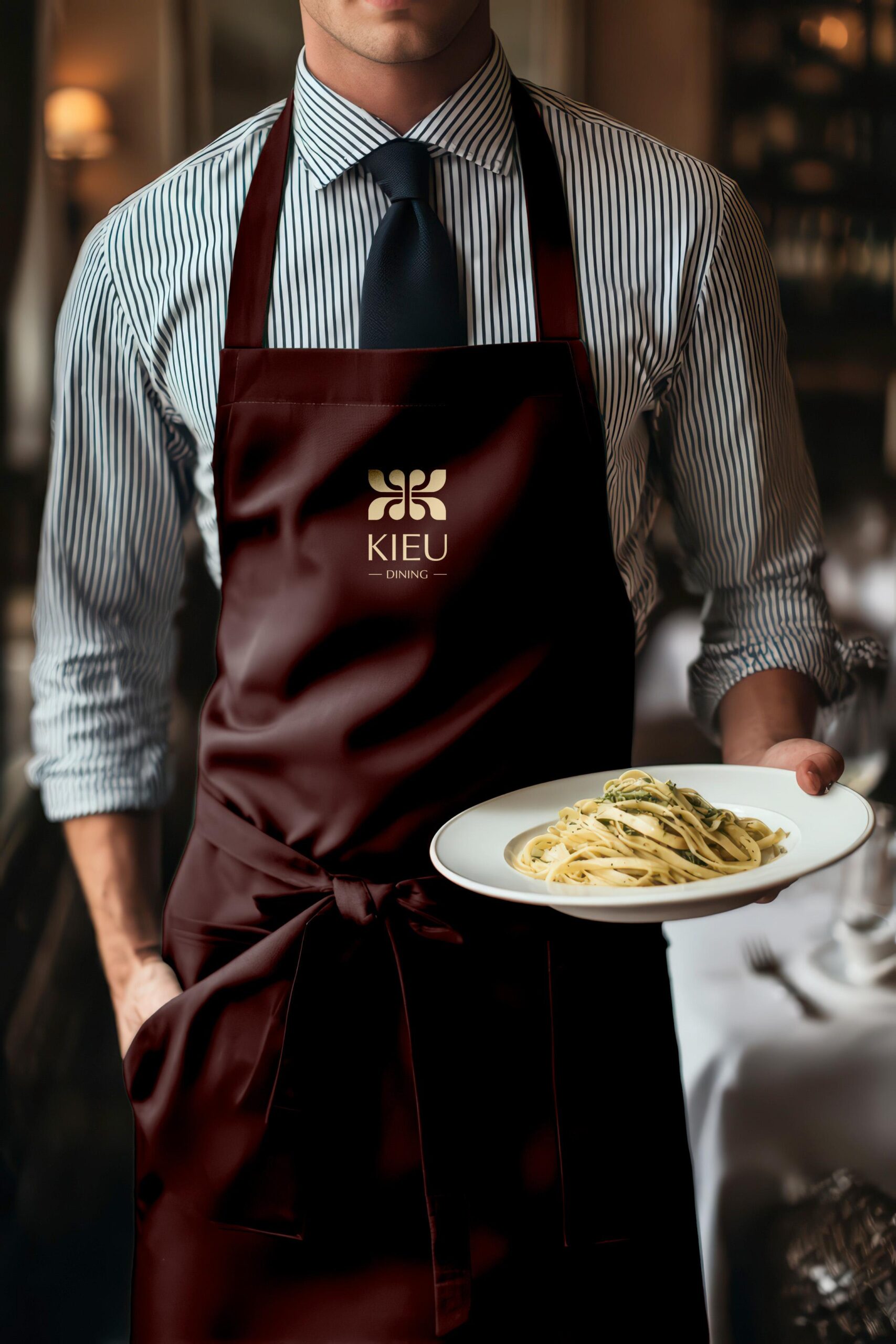
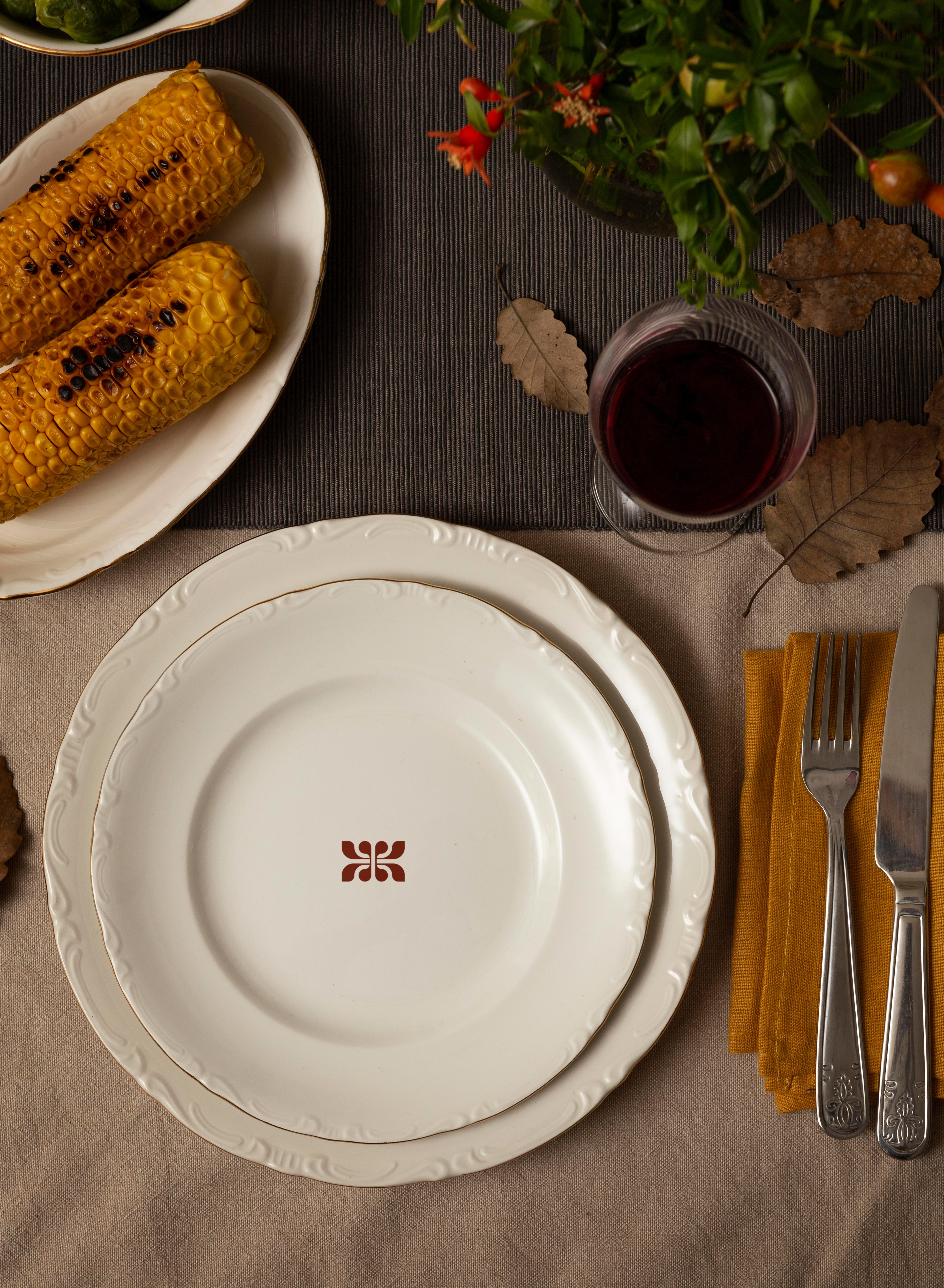
Kieu Dining
Where heritage meets harmony.


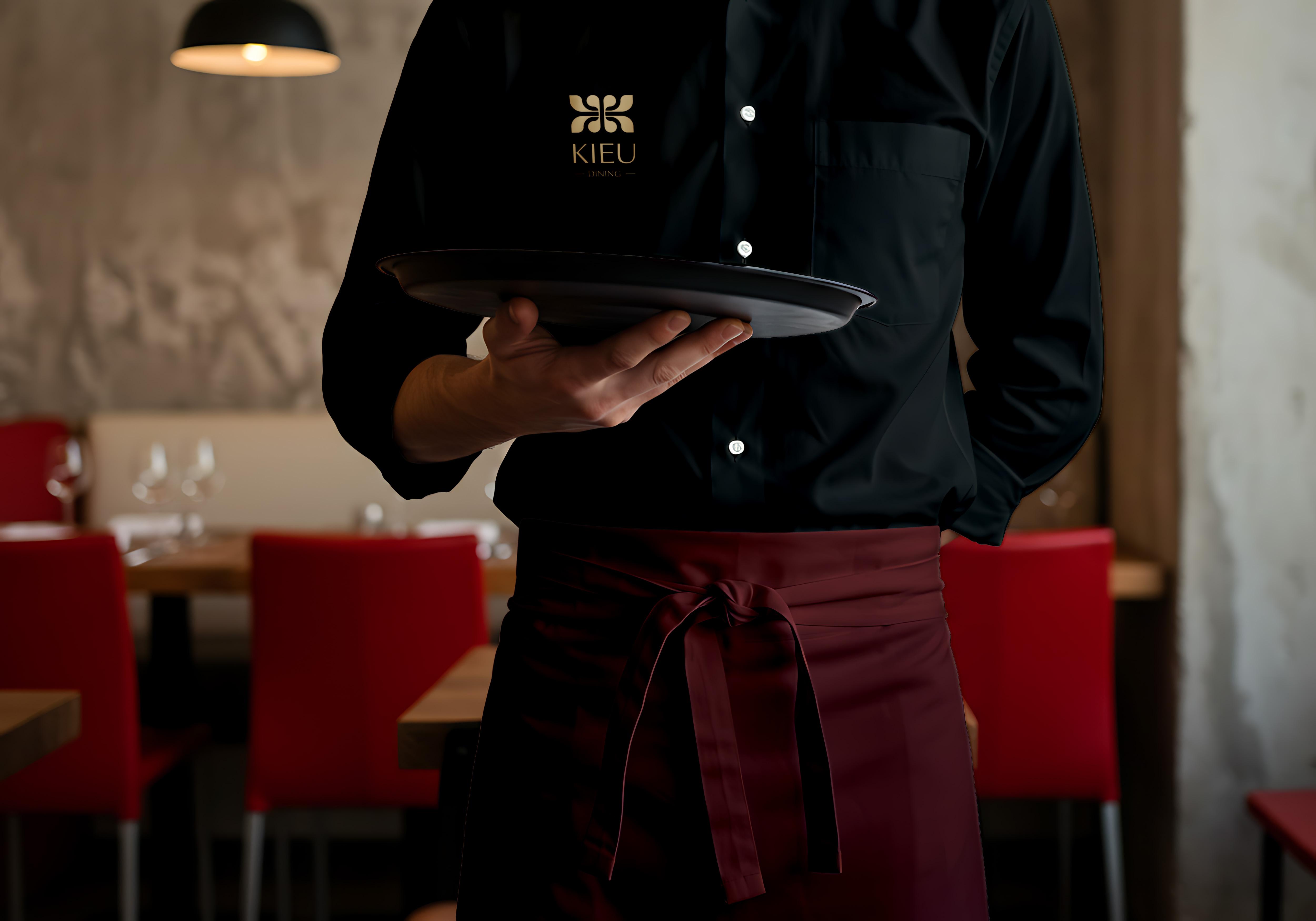
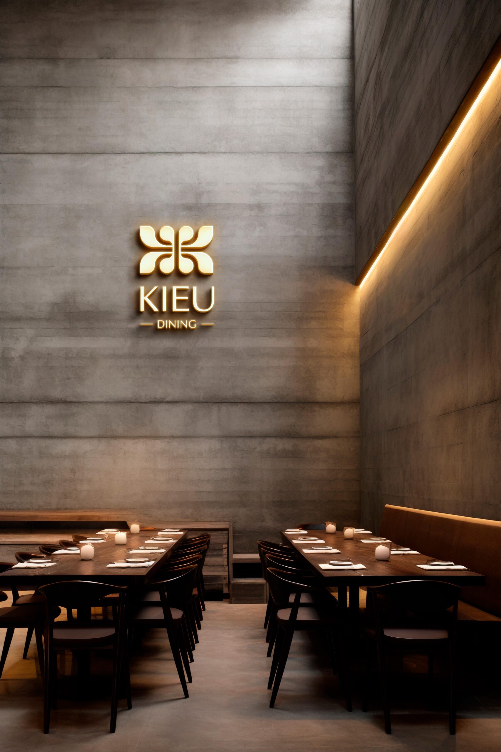
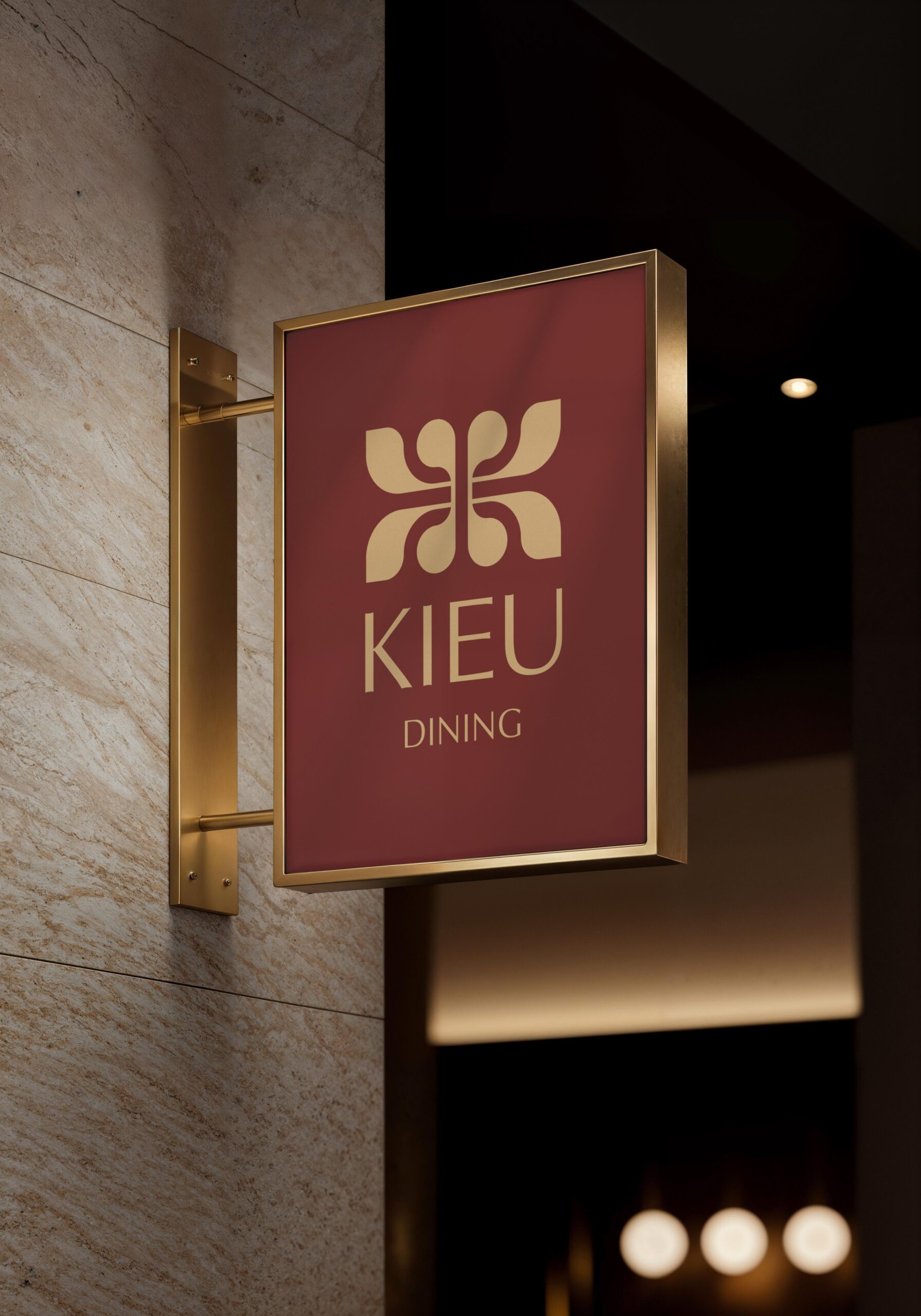
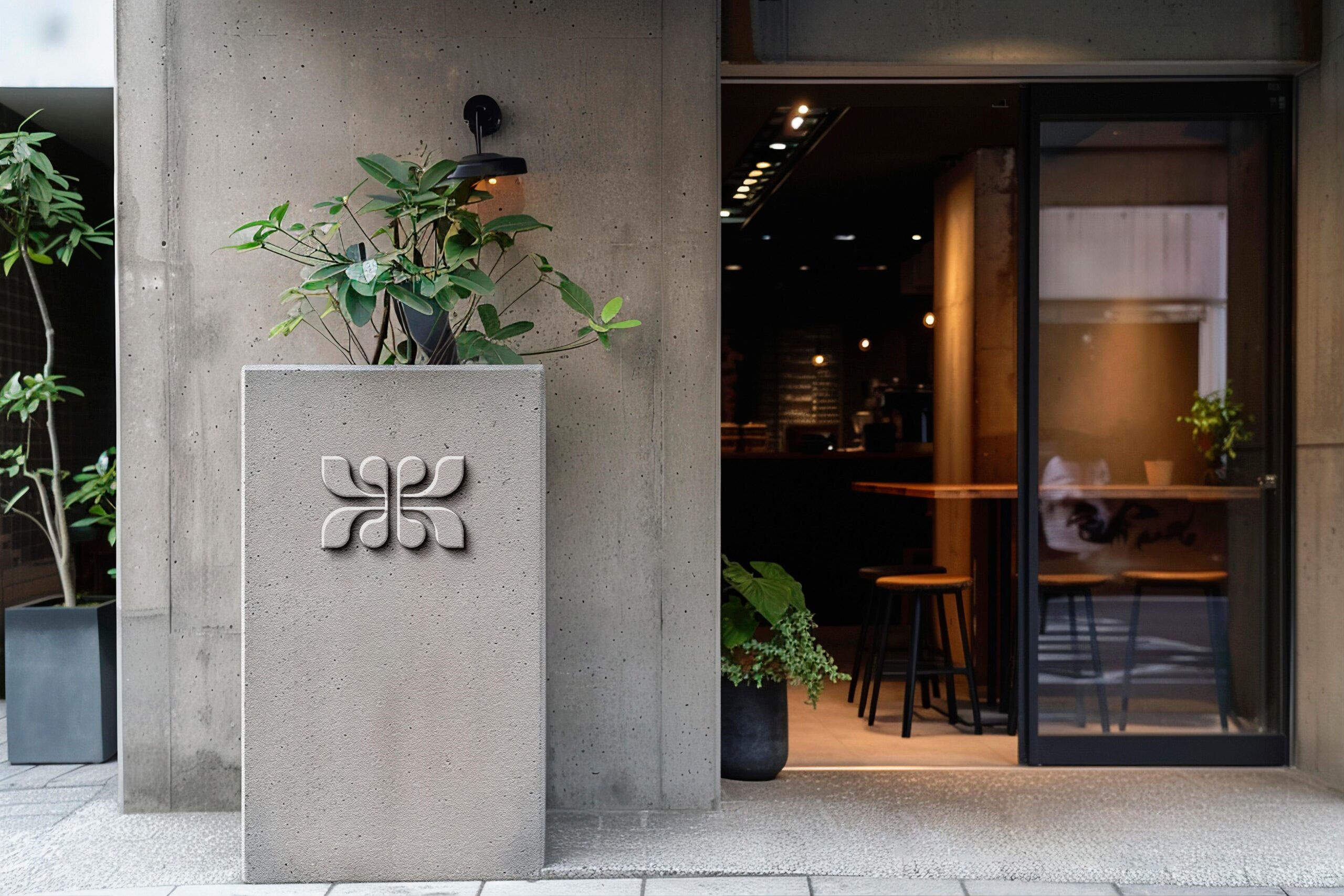
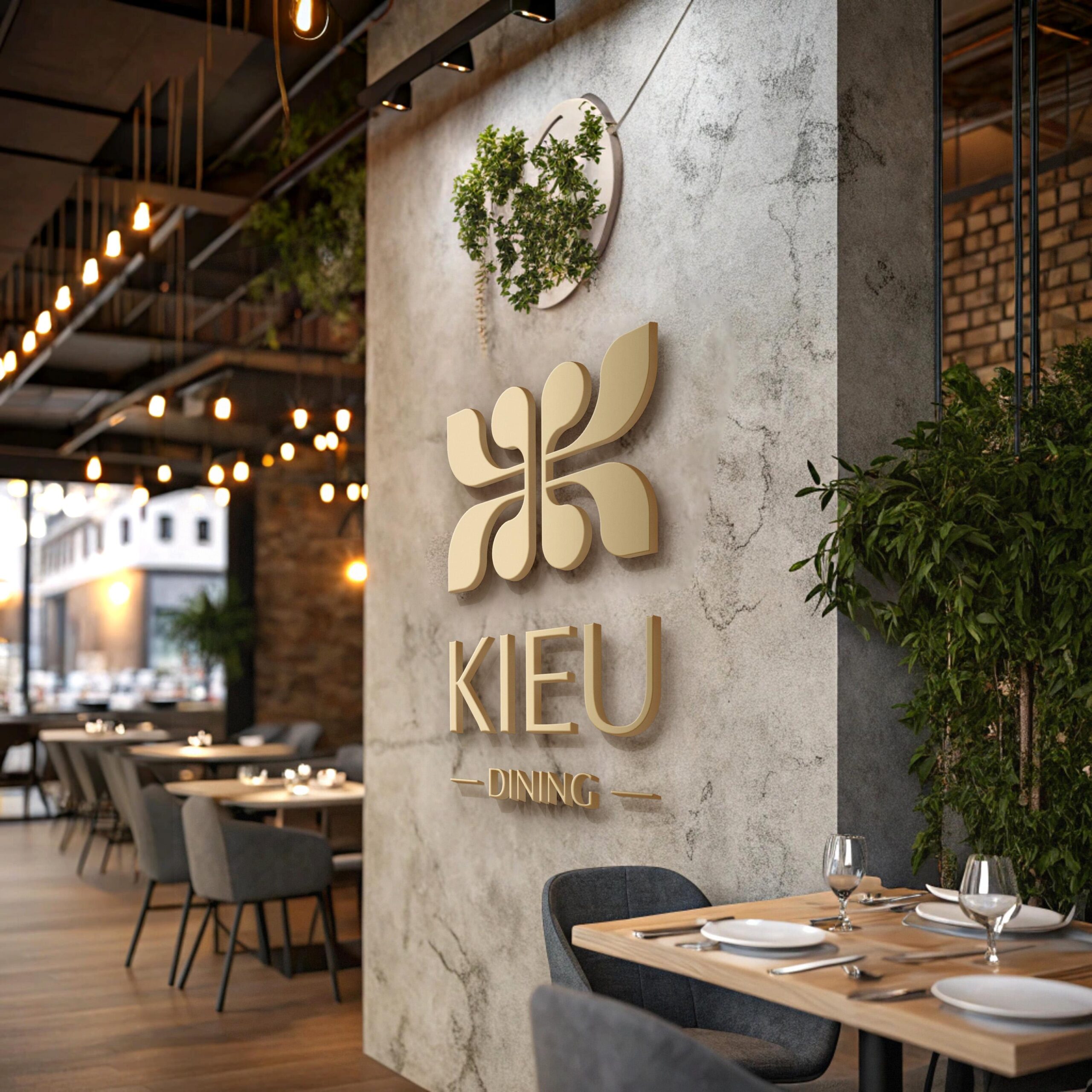
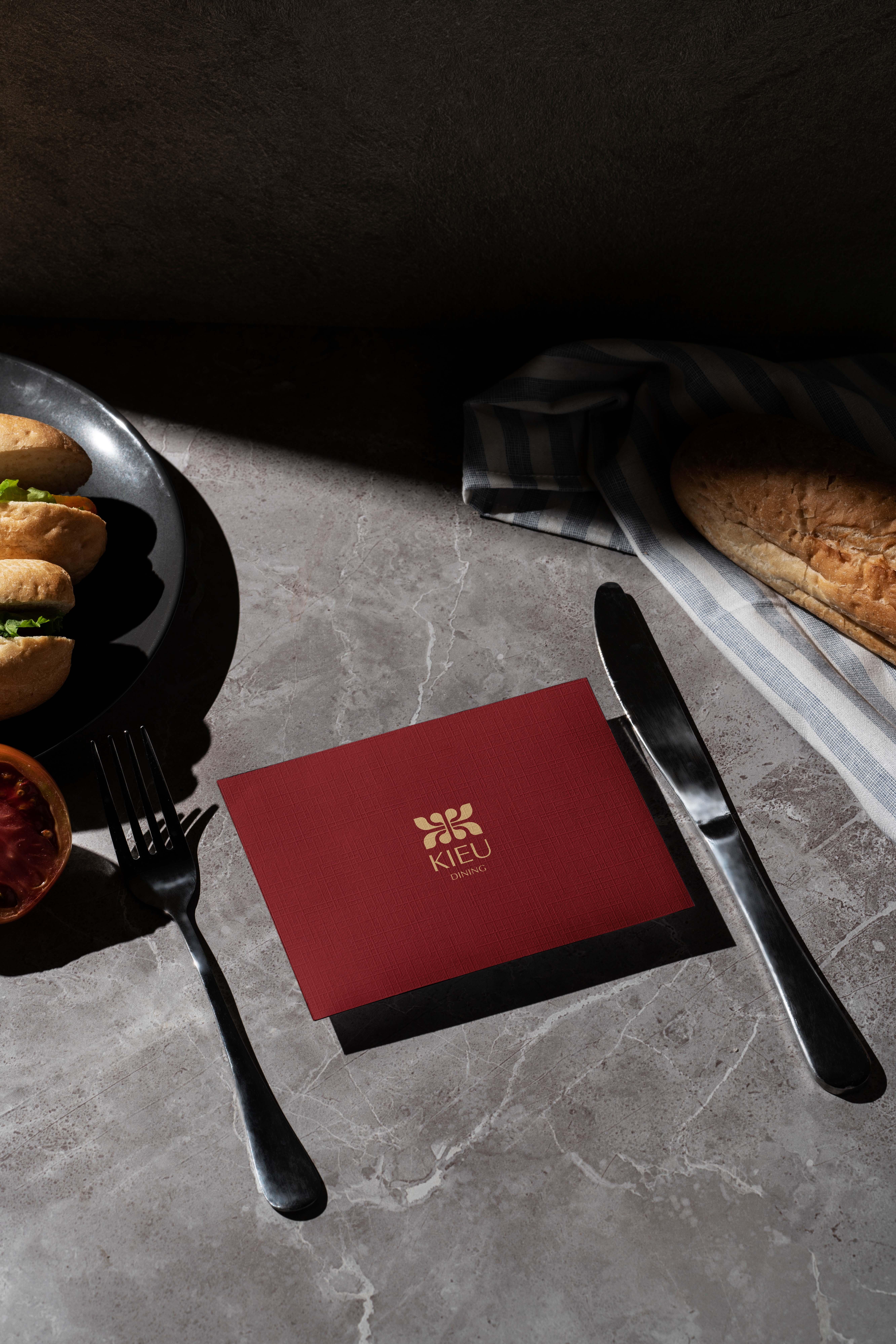
The logo for Kiều Dining is built around the letter “K,” stylized from traditional ornamental patterns found in Eastern architecture. Two mirrored “K” shapes interlock back-to-back, forming a symmetrical emblem that represents the harmony and connection embodied in the name Kiều.
Within the mark lies a subtle reference to the lotus flower - a timeless symbol of Vietnam - reflecting resilience, grace, and reverence for nature’s gifts. The result is a logo that merges cultural depth with contemporary refinement, honoring Vietnamese heritage through modern design expression.
Client: Kieu Dining
Sector: Restaurant
Country: Da Nang, Viet Nam • Year: 2025
Discipline: Visual Identity, Signage & Enviromental
Art Direction: Junz Nguyen
Design: Junz Nguyen
Sector: Restaurant
Country: Da Nang, Viet Nam • Year: 2025
Discipline: Visual Identity, Signage & Enviromental
Art Direction: Junz Nguyen
Design: Junz Nguyen

Got something on your mind? Talk to me!
© 2017 - 2025 Junz Nguyen Collective
All content on this website is the property of ©Junz Nguyen Collective. Reproduction, use, or modification is prohibited unless explicitly authorized by a formal agreement between both parties. All rights reserved.