An Di Hung Company
Built on strength, guided by vision.
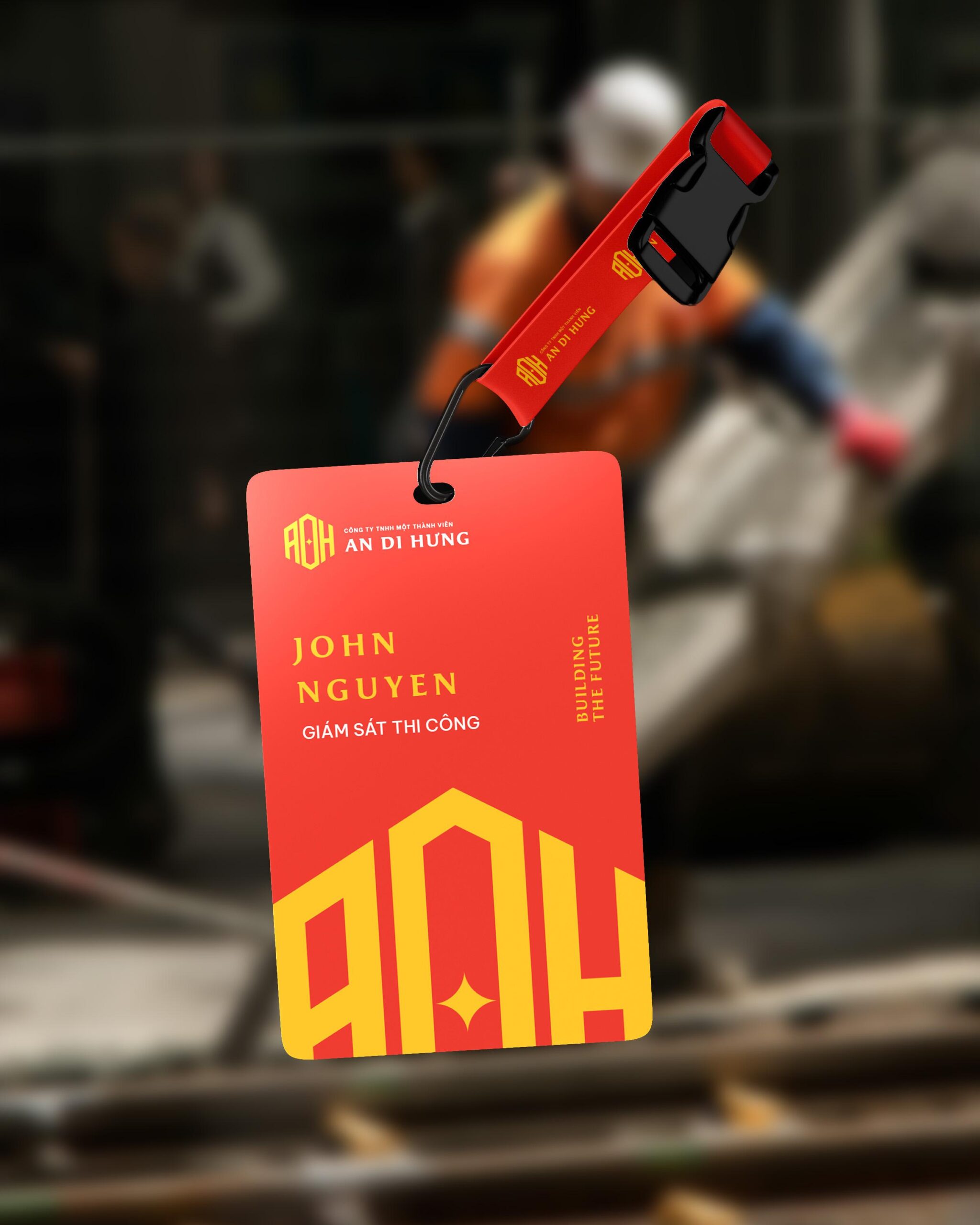
An Di Hung Company Limited is a multidisciplinary enterprise operating across logistics, construction, and project contracting. The company’s identity was designed to embody the values of strength, reliability, and progress, representing a business foundation built on trust and long-term vision.
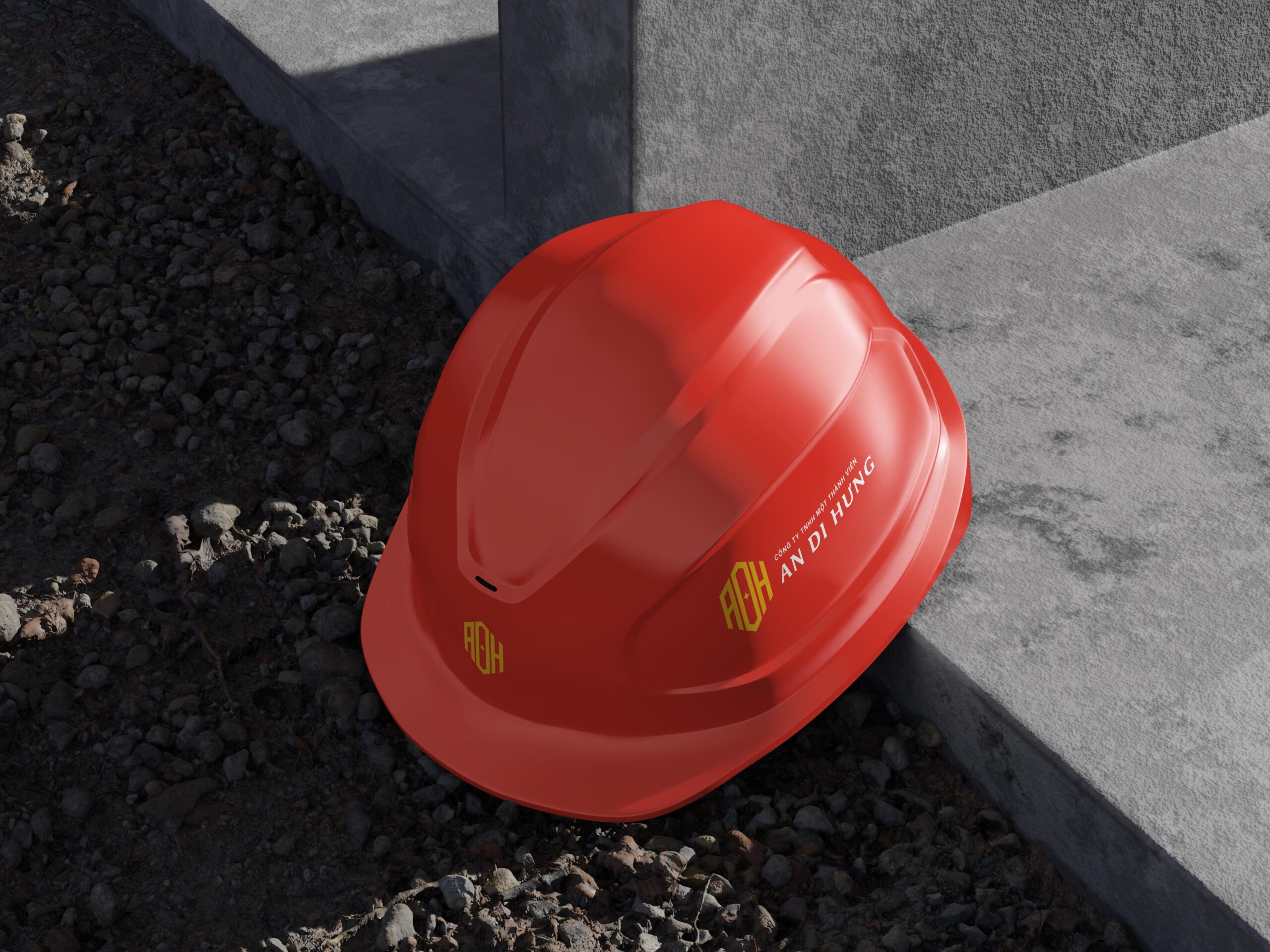
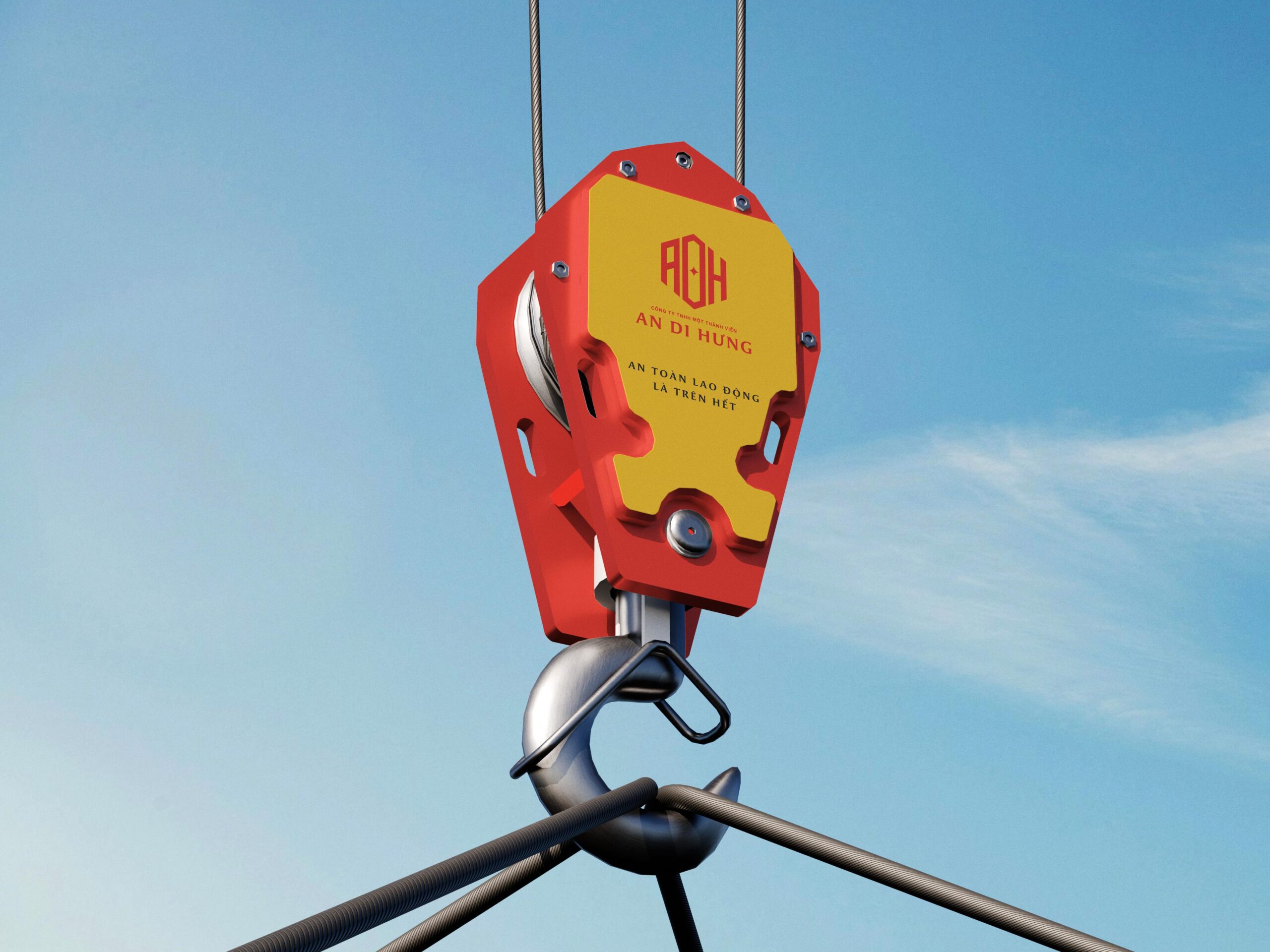
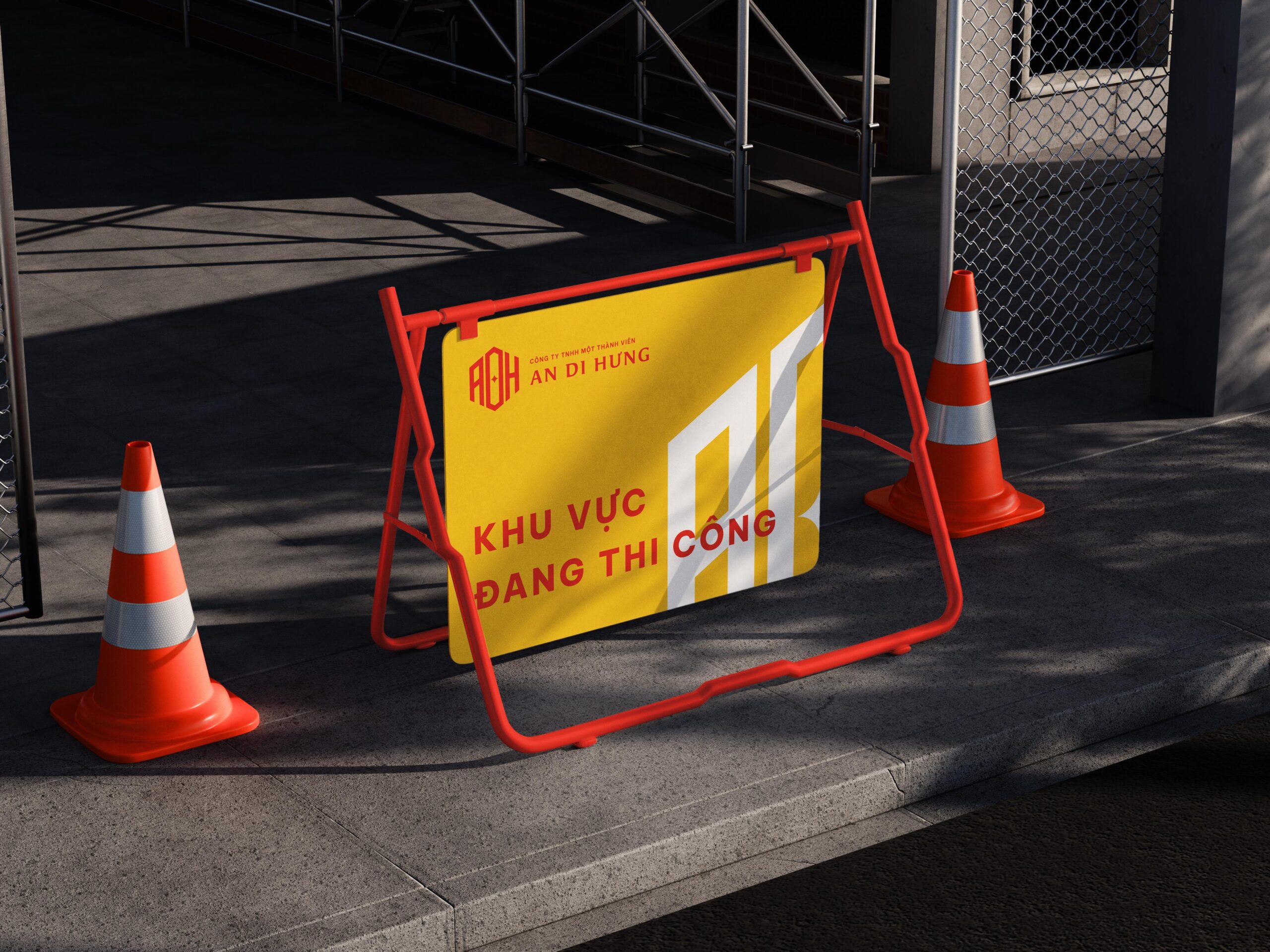
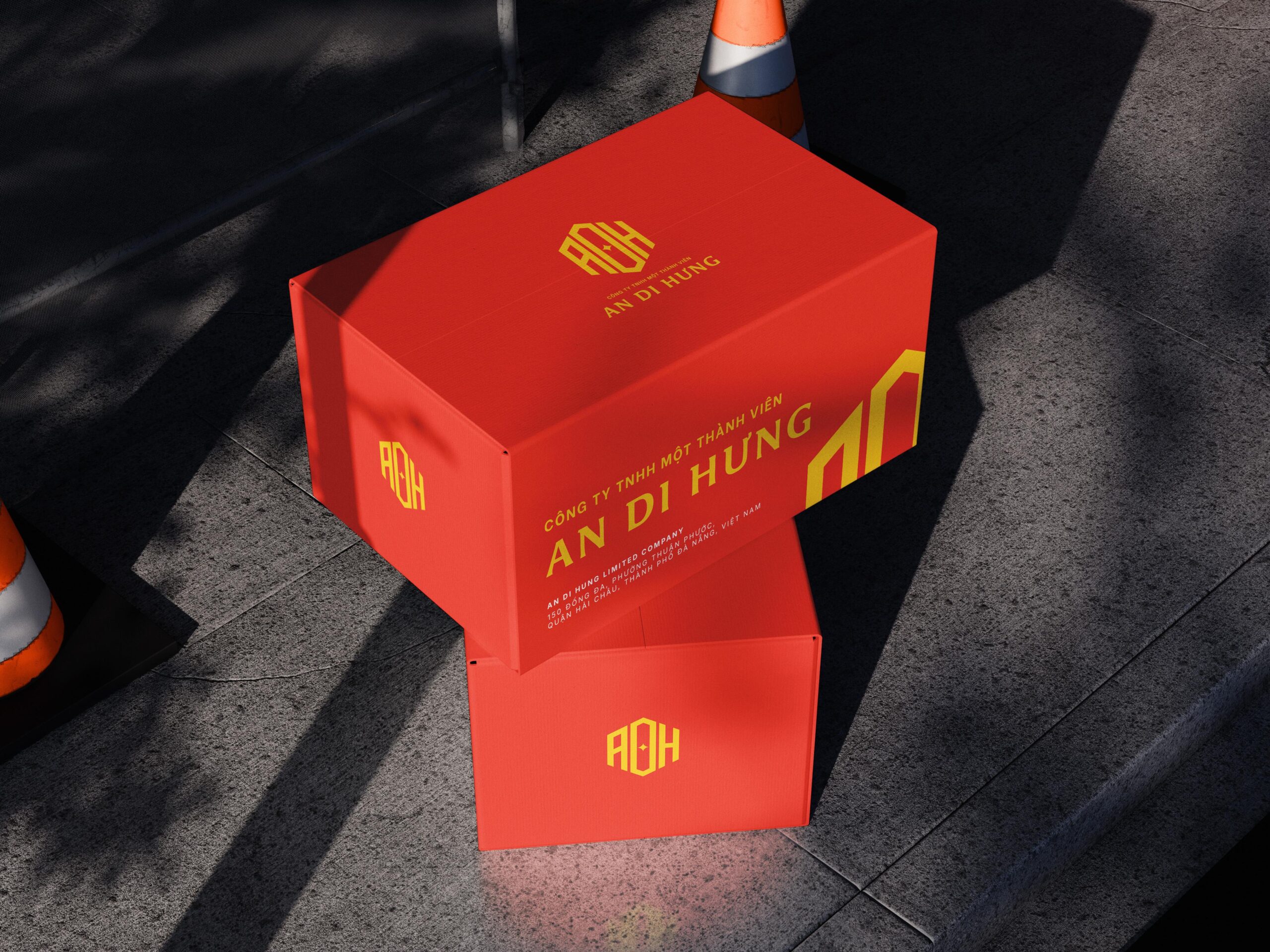
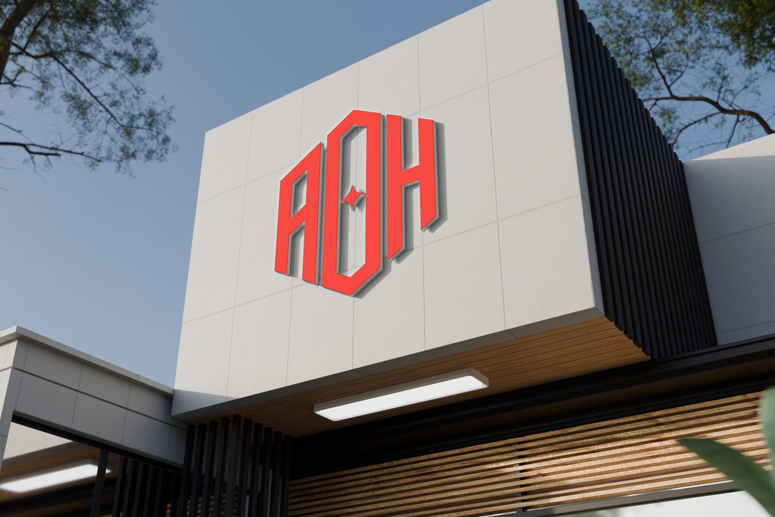
The logo mark takes the initials ADH and stylizes them into a solid geometric form, symbolizing architectural precision and structural integrity. The hexagonal outline conveys a sense of unity and protection, while the central golden star represents guidance, ambition, and prosperity — key values that drive the company’s continuous growth.The color palette combines a bold industrial red with gold accents, expressing both energy and prestige. Together, they reflect An Di Hung’s commitment to excellence in every field it operates — from logistics coordination to major construction projects.
The result is a modern yet timeless logo system that communicates both corporate confidence and Vietnamese authenticity, adaptable across various applications from uniforms to site signage and digital platforms.
Client: An Di Hung Company Limited
Sector: Construction
Country: Da Nang, Viet Nam • Year: 2022
Discipline: Visual Identity, Signage & Enviromental
Art Direction: Junz Nguyen
Design: Junz Nguyen
Sector: Construction
Country: Da Nang, Viet Nam • Year: 2022
Discipline: Visual Identity, Signage & Enviromental
Art Direction: Junz Nguyen
Design: Junz Nguyen
Got something on your mind? Talk to me!
© 2017 - 2025 Junz Nguyen Collective
All content on this website is the property of ©Junz Nguyen Collective. Reproduction, use, or modification is prohibited unless explicitly authorized by a formal agreement between both parties. All rights reserved.


