
Reborn - Musculoskeletal Therapy & Movement Restoration System
Living well without medication


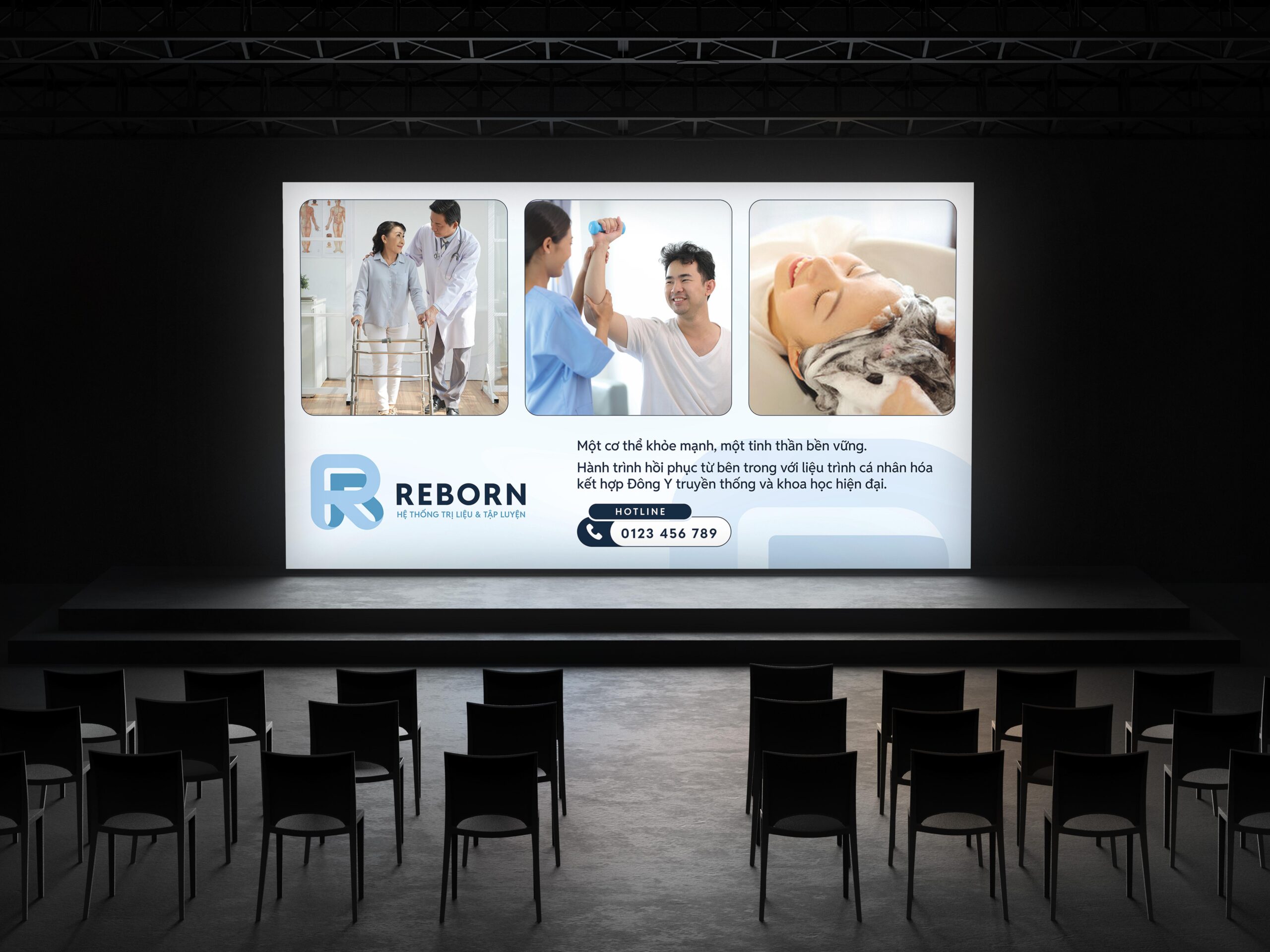
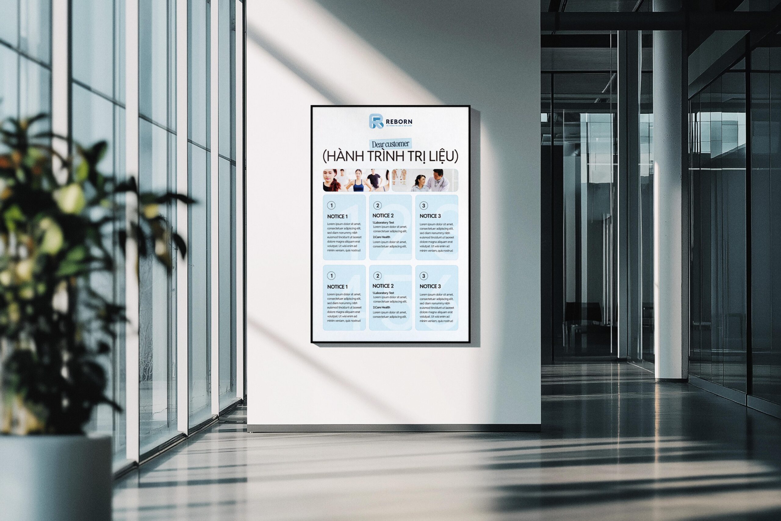
REBORN embraces a simple yet powerful philosophy: living well without medication. Throughout its journey supporting thousands of clients, the brand has consistently championed natural, safe, and sustainable therapeutic methods tailored for the Vietnamese community. More than a treatment facility, REBORN represents a holistic, human-centered health system - a place where individuals rediscover movement, regain balance, and rebuild their physical well-being.
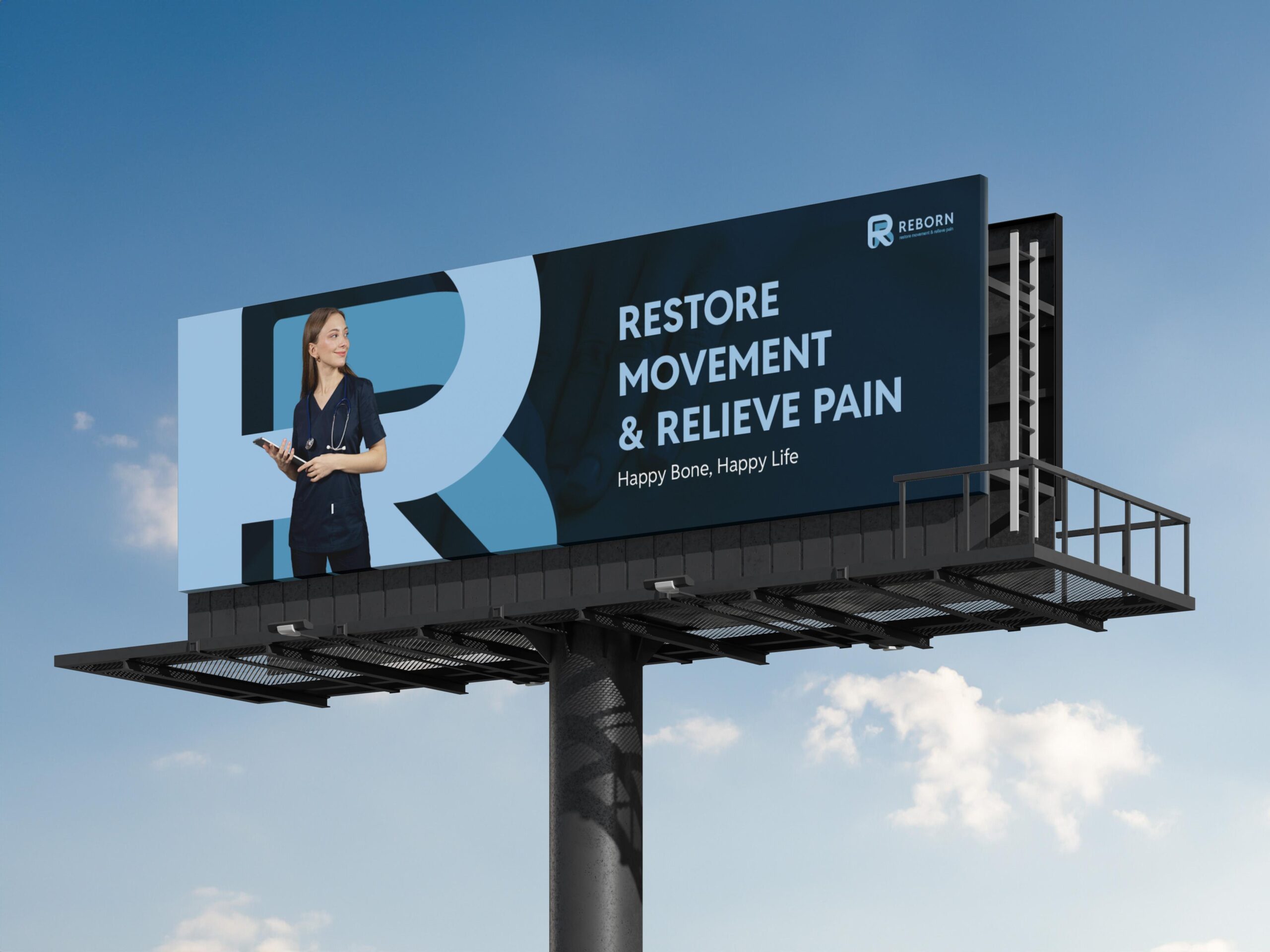
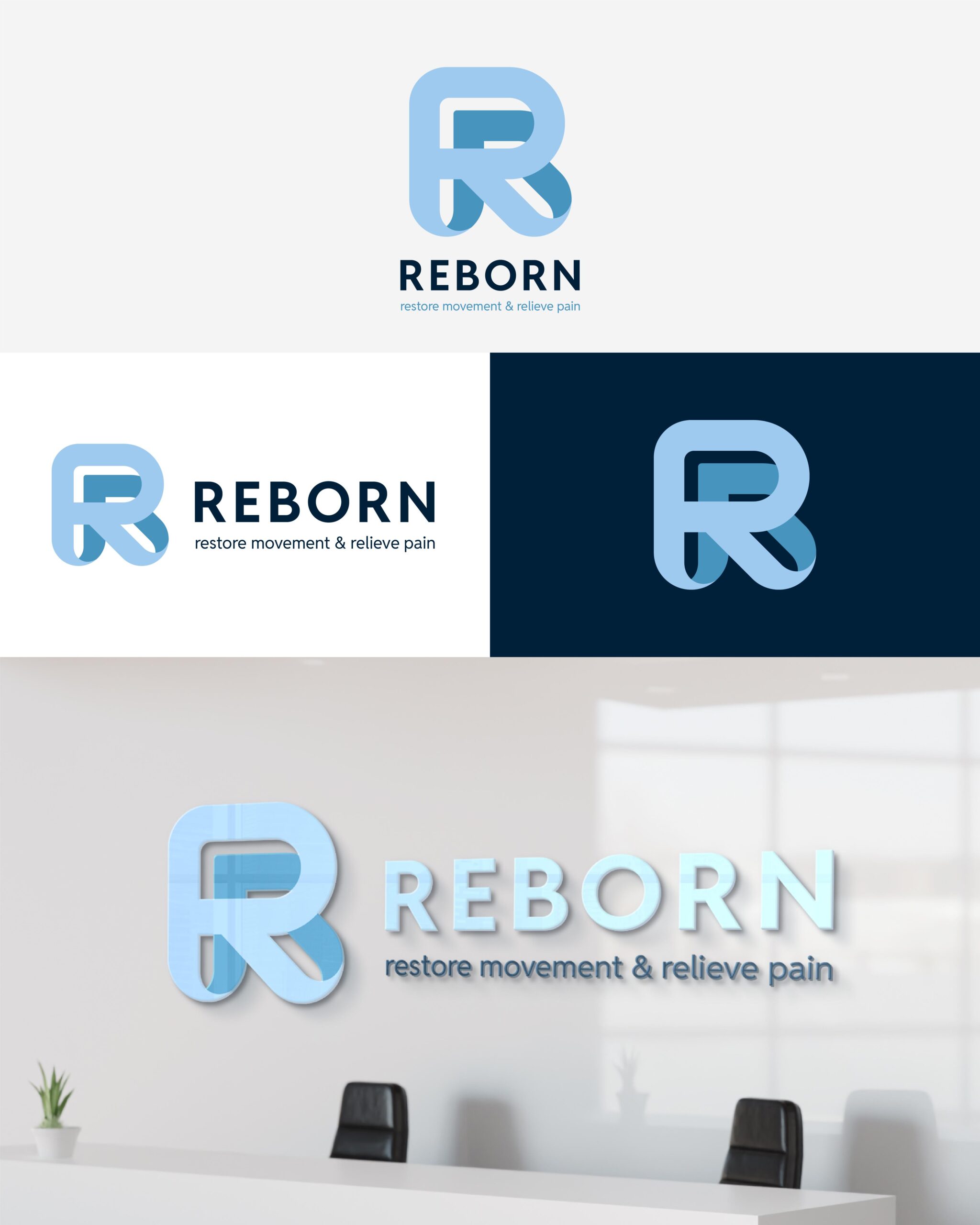
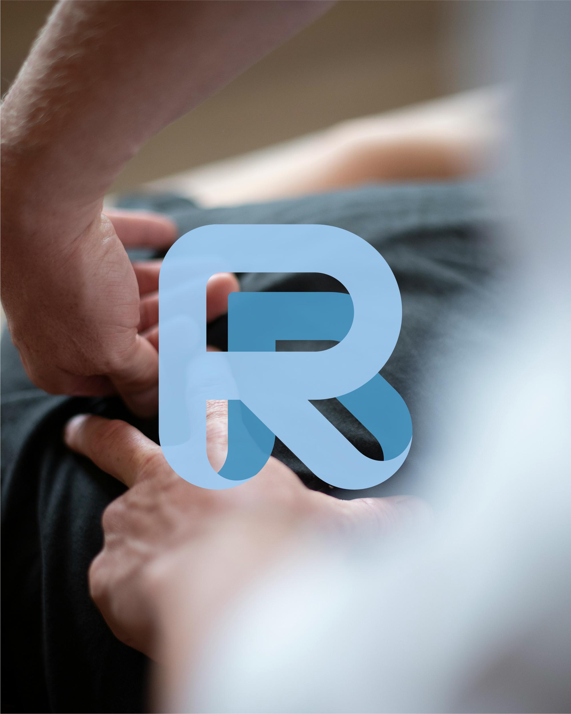
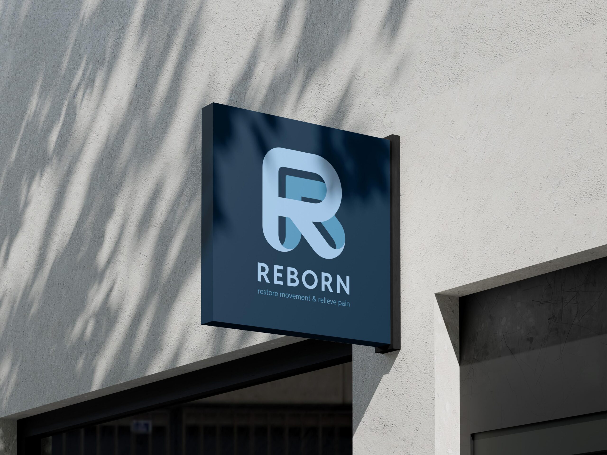
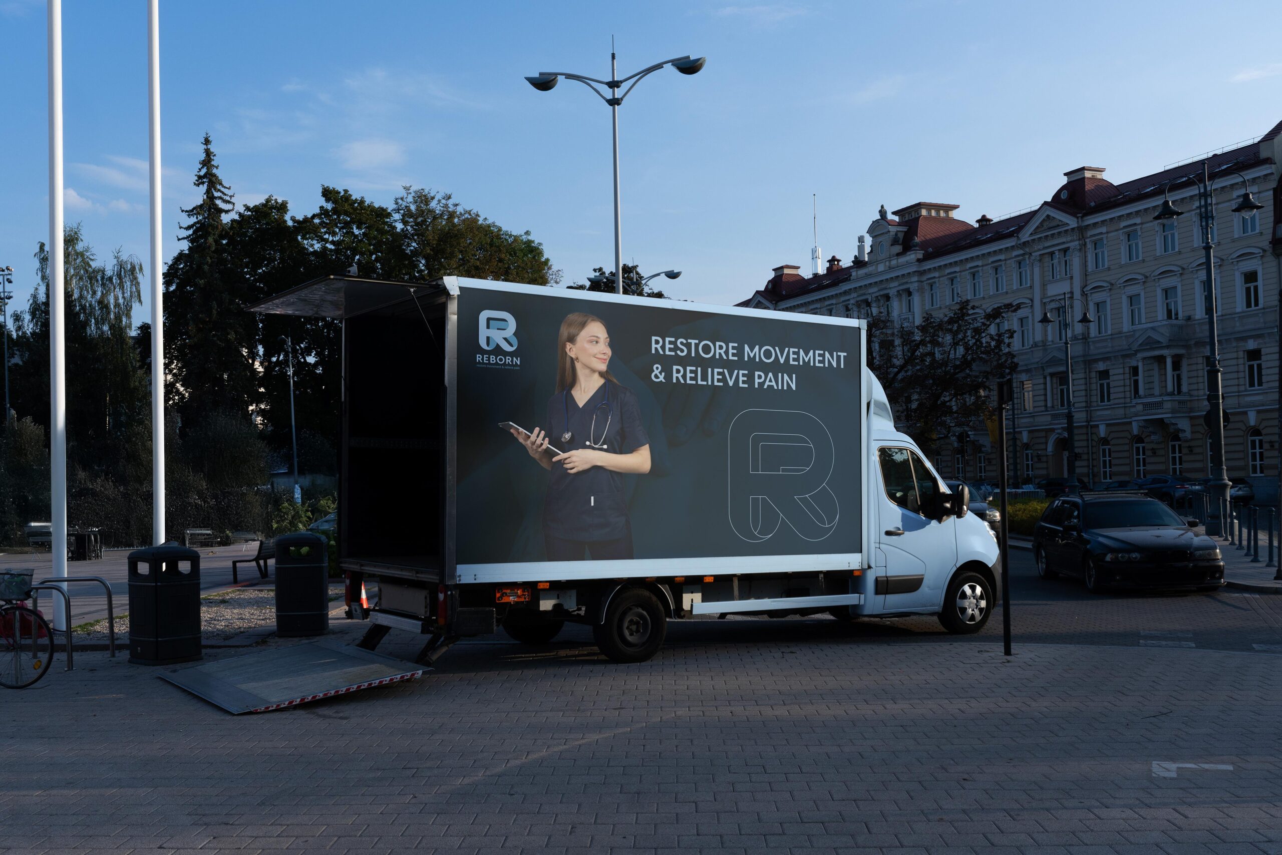
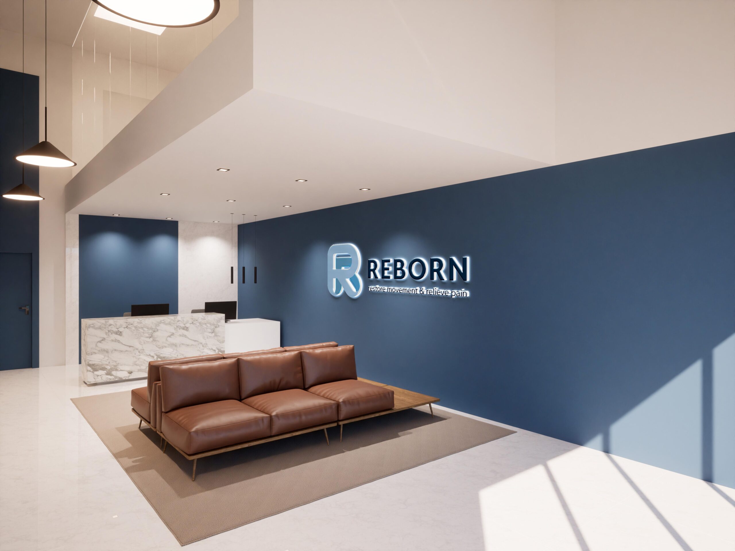
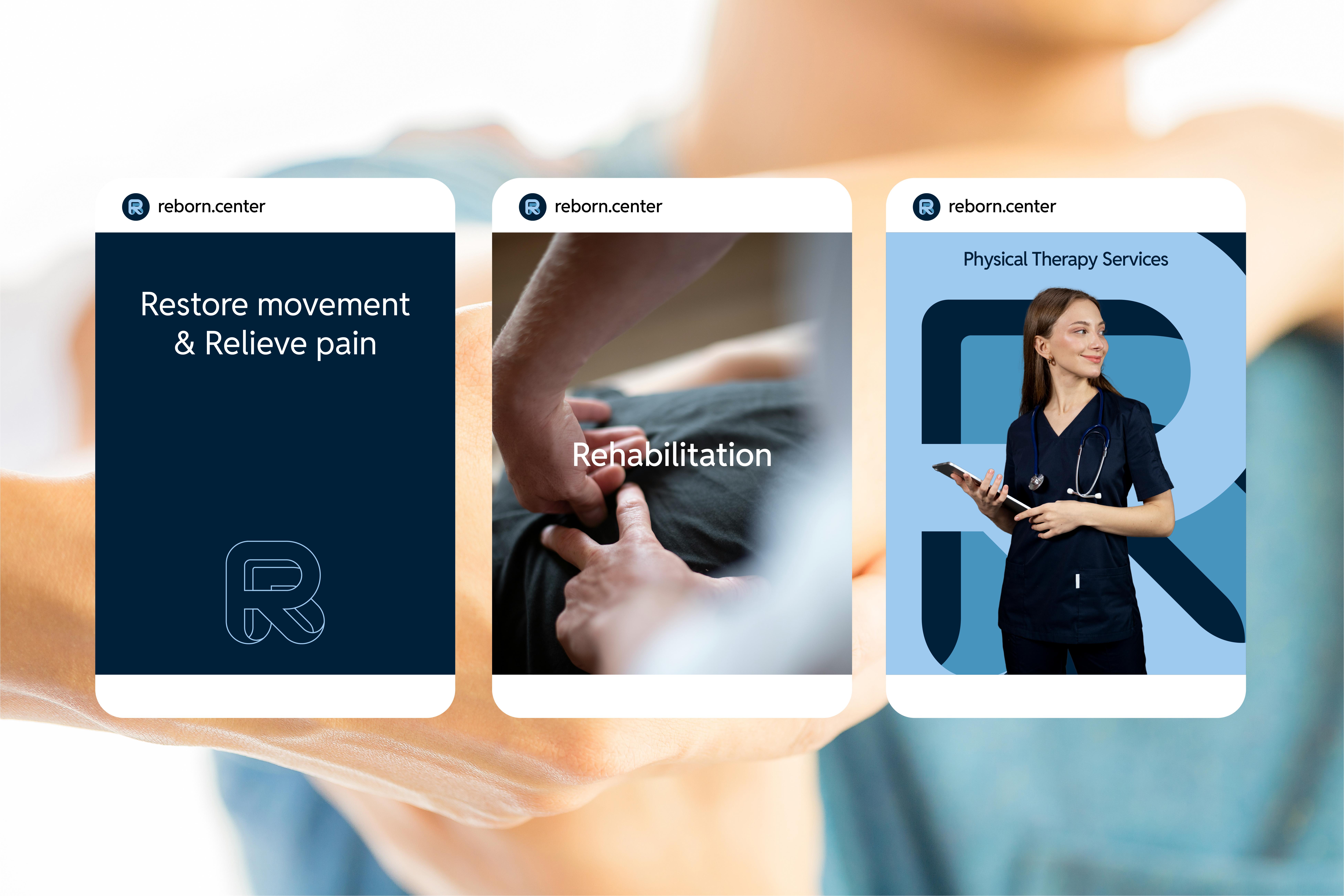
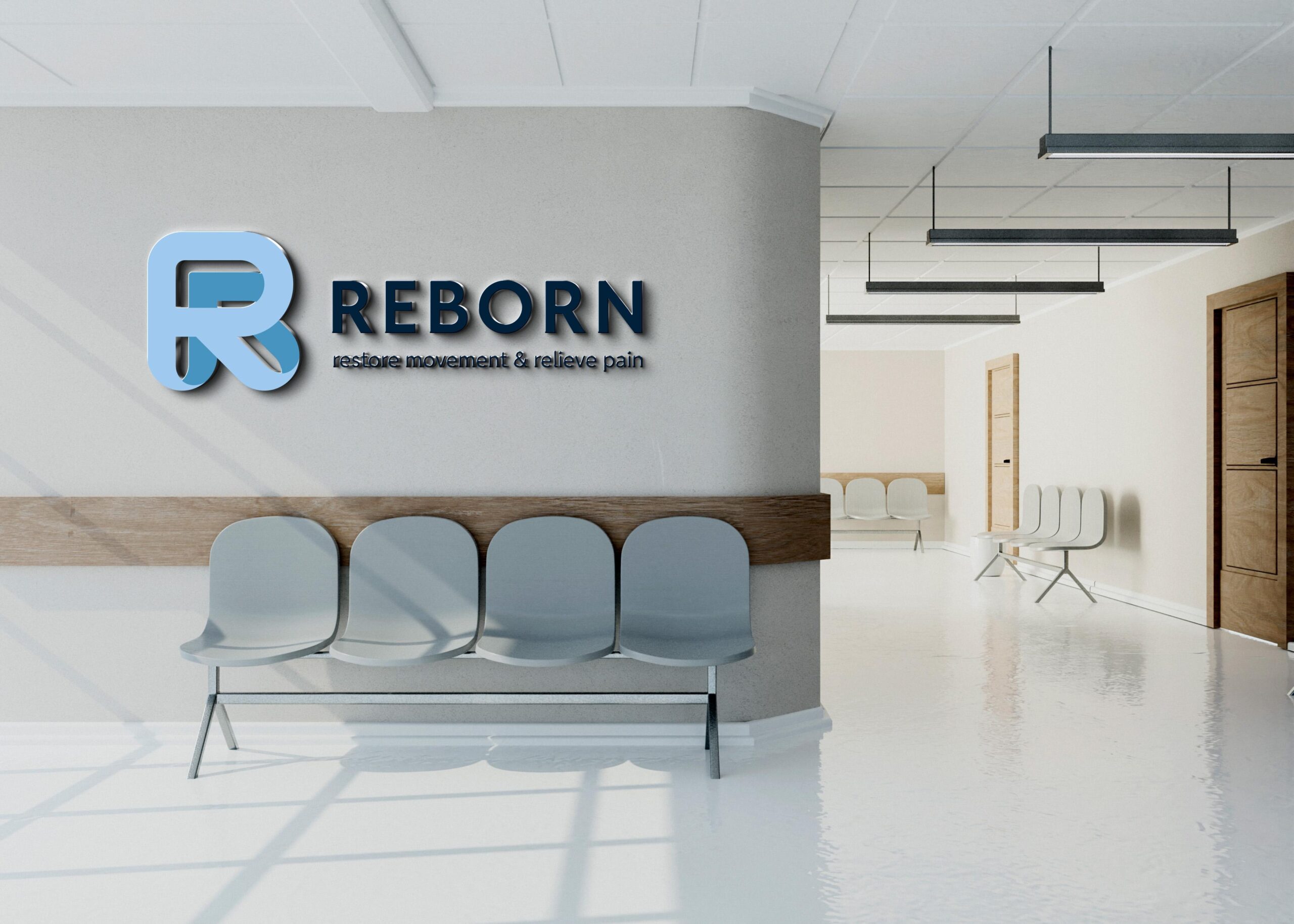
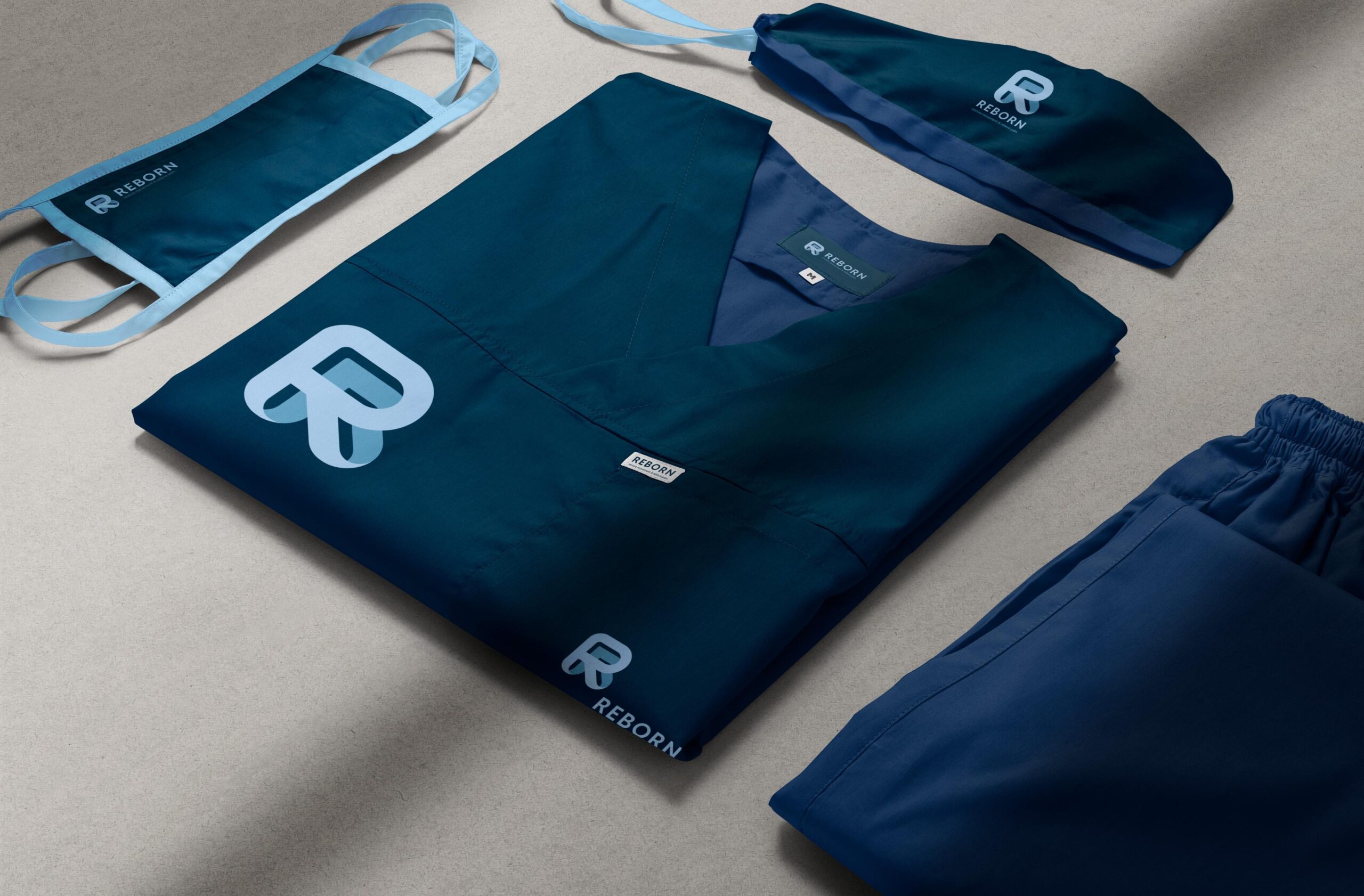
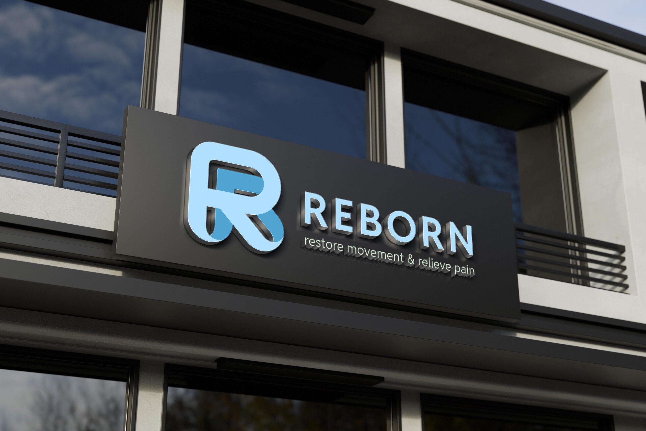
The new brand identity captures this spirit of renewal. The logo features a stylized letter “R” shaped as a continuous ribbon, symbolizing connection, perseverance, and the long-term companionship between therapists and clients throughout the healing process. The ribbon is crafted with contrasting inner and outer layers, reflecting transformation, from limitation to liberation, from pain to revitalized strength. This duality illustrates the idea of being “reborn” into a better version of oneself.
Soft, flowing curves give the mark a sense of fluidity and precision, echoing the expertise and gentle skill of REBORN’s practitioners. The overall identity communicates trust, care, and the promise of sustained improvement, perfectly aligning with the brand’s mission to restore movement and relieve pain through natural, human-focused therapy.
Client: Reborn Musculoskeletal Therapy & Movement Restoration System
Sector: Health & Wellness
Country: Ho Chi Minh City, Viet Nam • Year: 2025
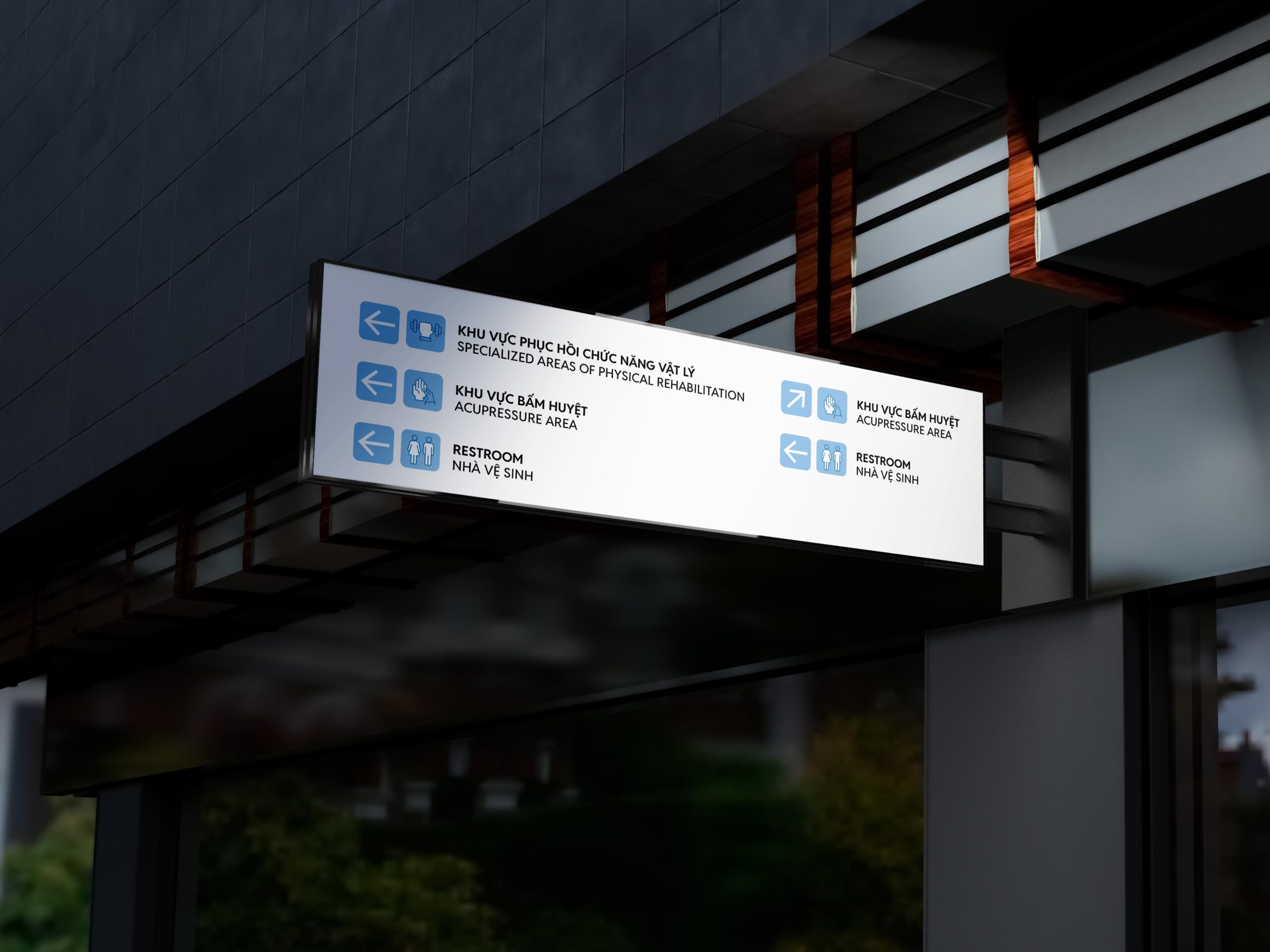
Discipline: Visual Identity, Signage & Enviromental
Art Direction: Junz Nguyen
Design: Junz Nguyen
Sector: Health & Wellness
Country: Ho Chi Minh City, Viet Nam • Year: 2025
Discipline: Visual Identity, Signage & Enviromental
Art Direction: Junz Nguyen
Design: Junz Nguyen

Got something on your mind? Talk to me!
© 2017 - 2025 Junz Nguyen Collective
All content on this website is the property of ©Junz Nguyen Collective. Reproduction, use, or modification is prohibited unless explicitly authorized by a formal agreement between both parties. All rights reserved.