
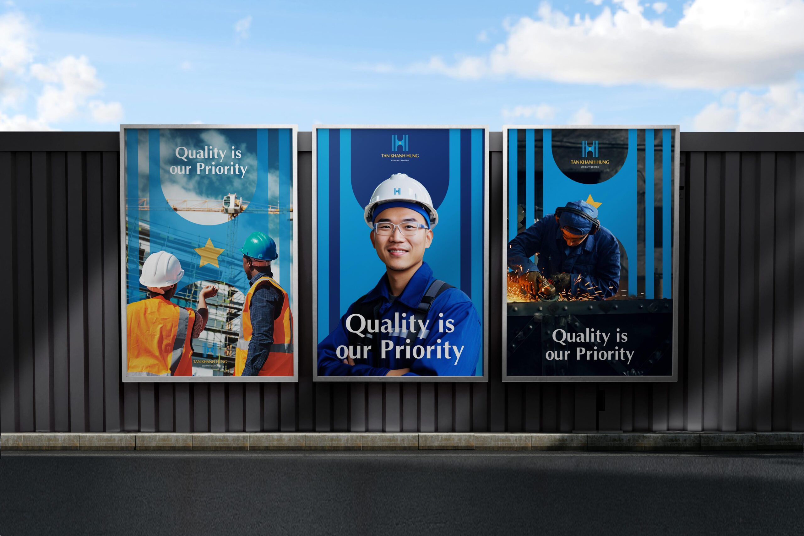
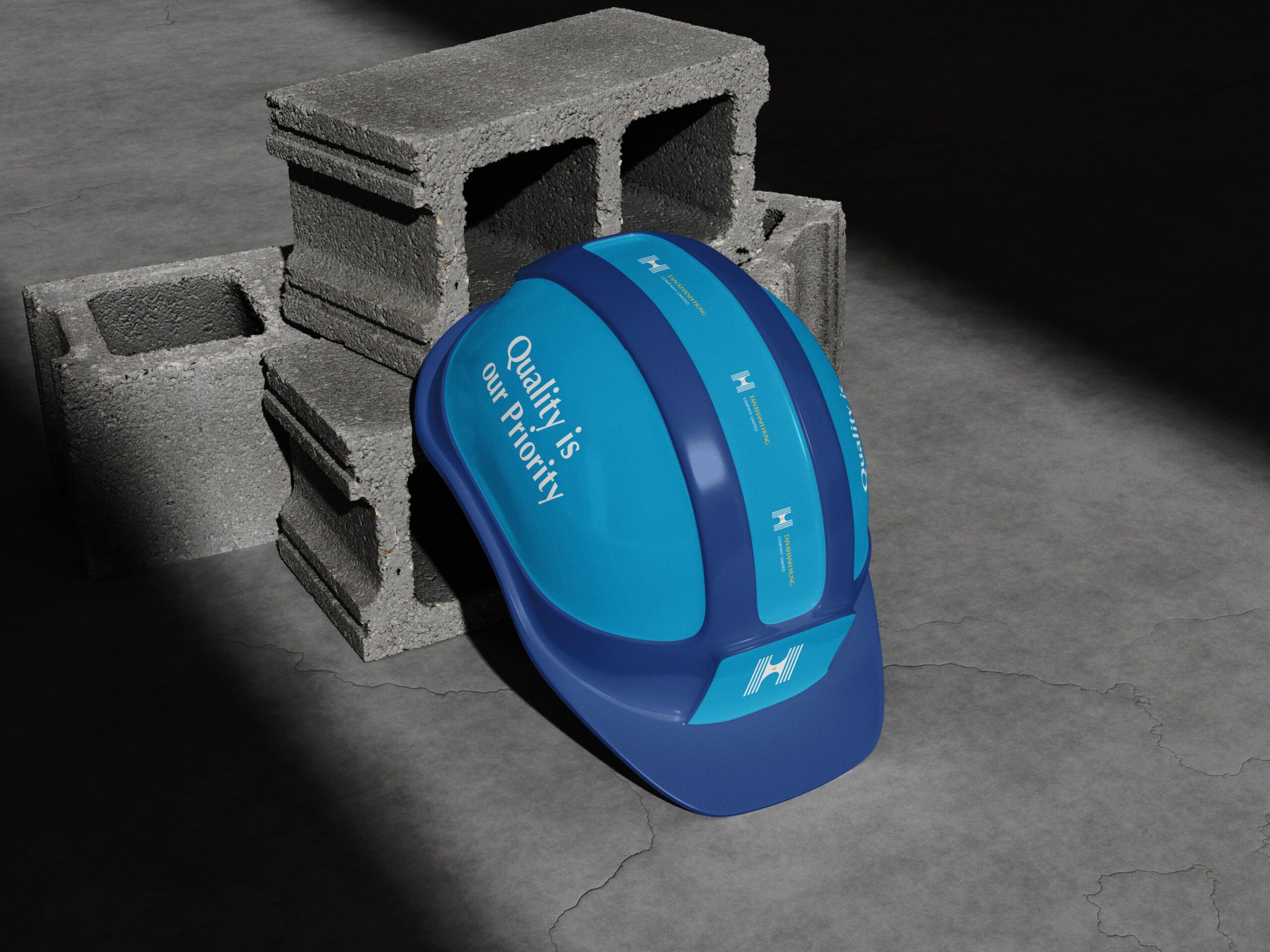
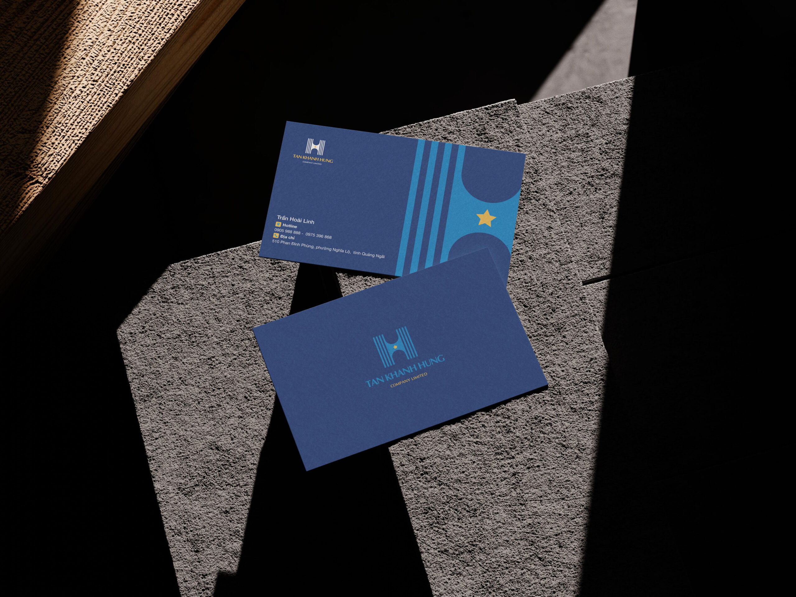
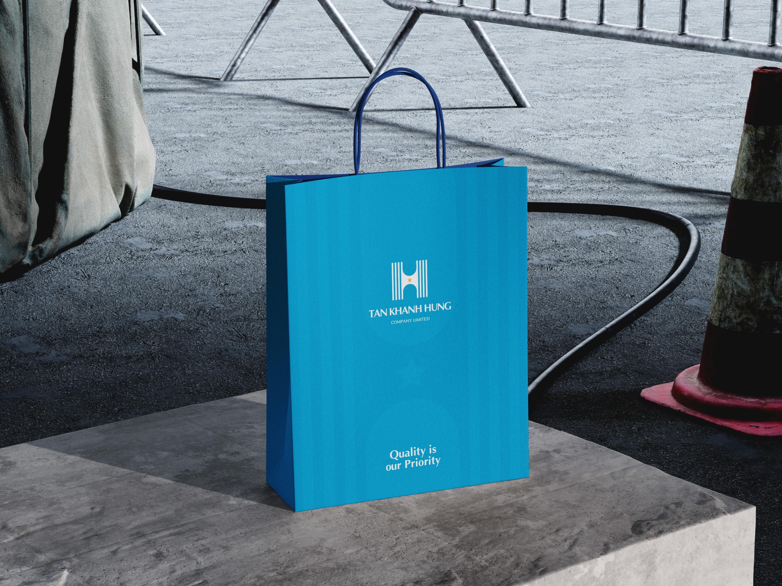
Tan Khanh Hung Company
Built on strength, guided by vision.


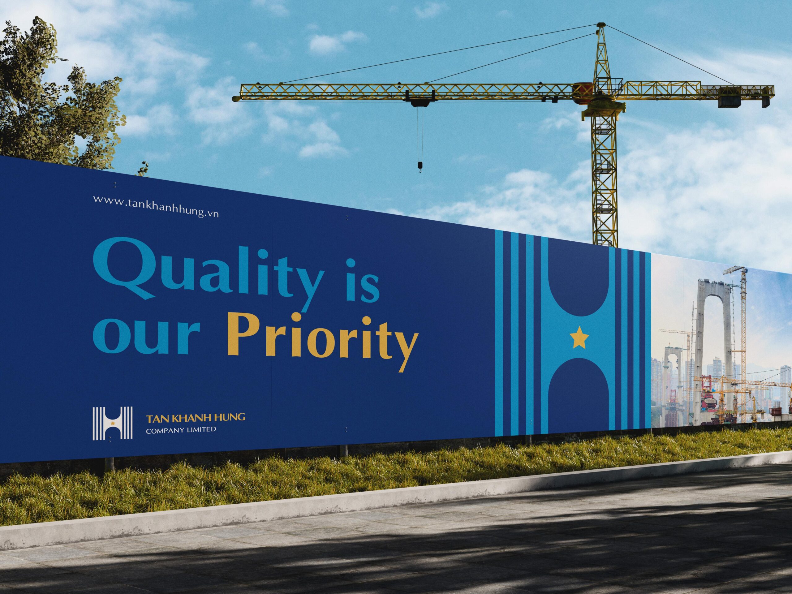
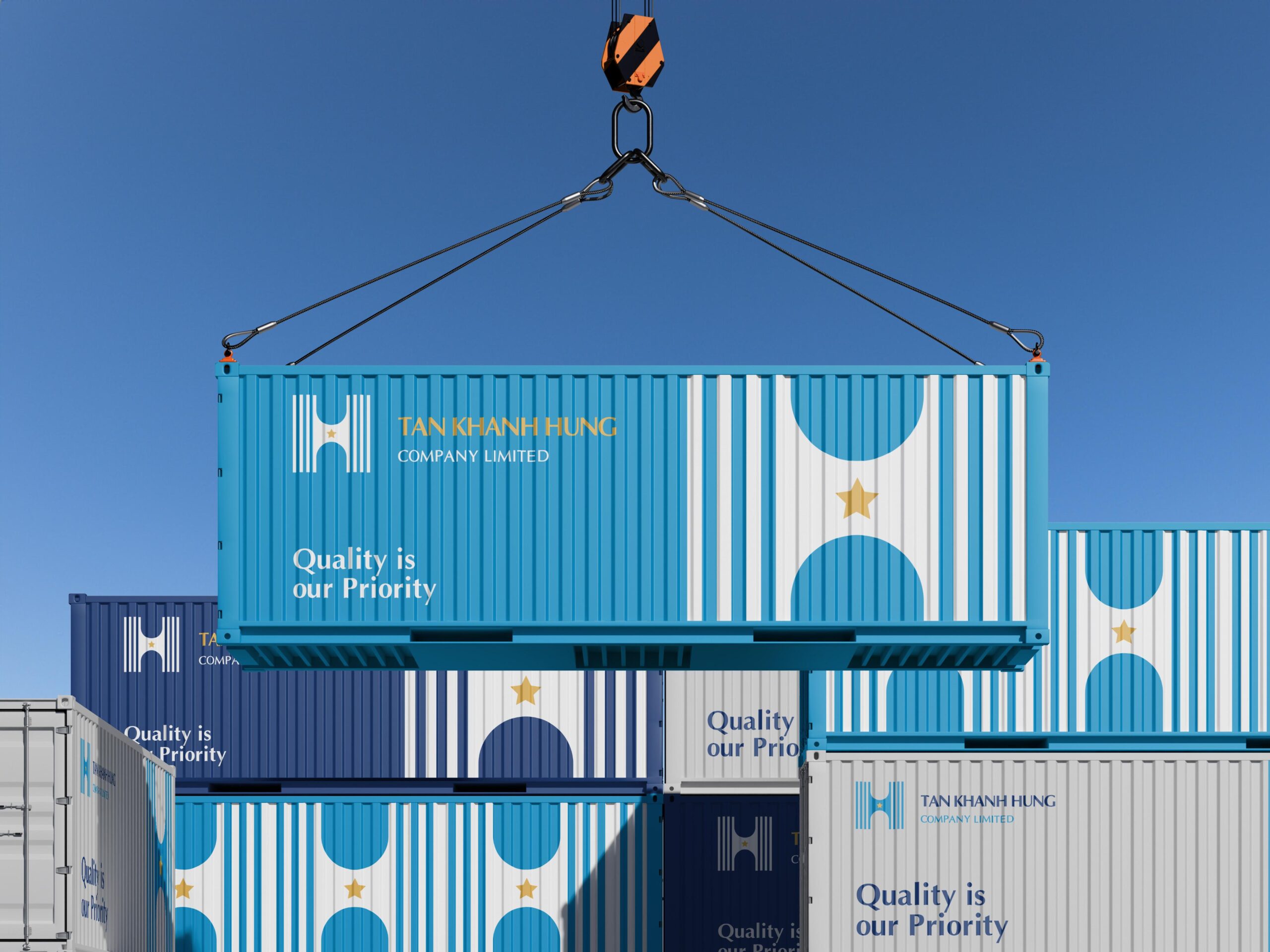
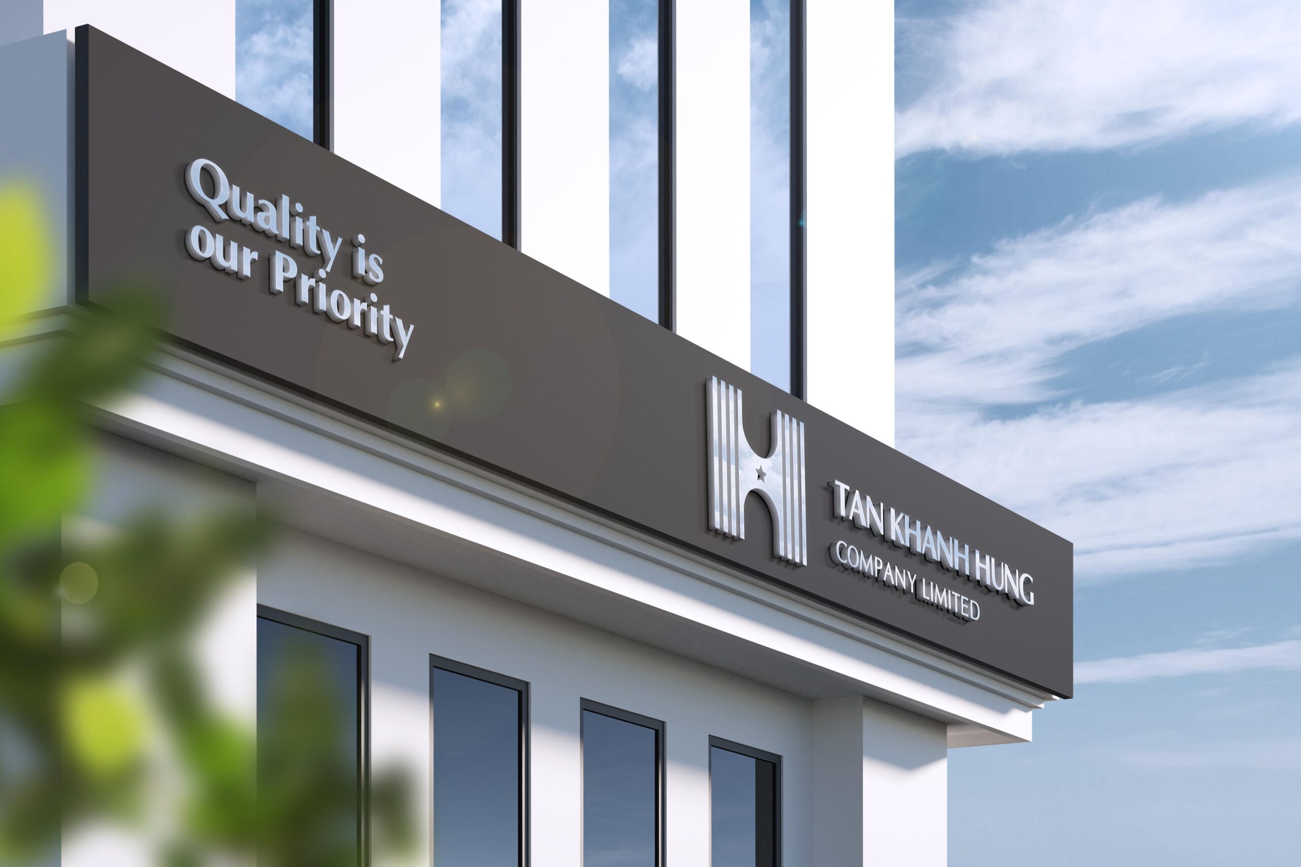
The logo of Tan Khanh Hung Construction Company Limited is built around the letter “H”, creatively stylized to resemble the form of bridges and gateways, symbols of connection, progress, and enduring strength. The vertical lines evoke architectural precision and structural integrity, reflecting the company’s expertise in the construction industry.
A golden star accompanies the design, representing the company’s commitment to excellence, quality, and trustworthiness in every project it undertakes. The harmonious combination of bold geometry and refined simplicity conveys professionalism, stability, and forward vision.
Through this identity, Tan Khanh Hung affirms its role as a reliable and innovative contractor - building not only solid structures but also lasting value and confidence for its partners and clients.
Client: Tan Khanh Hung Company Limited
Sector: Construction
Country: Da Nang, Viet Nam • Year: 2025
Discipline: Visual Identity, Signage & Enviromental
Art Direction: Junz Nguyen
Design: Junz Nguyen
Sector: Construction
Country: Da Nang, Viet Nam • Year: 2025
Discipline: Visual Identity, Signage & Enviromental
Art Direction: Junz Nguyen
Design: Junz Nguyen

Got something on your mind? Talk to me!
© 2017 - 2025 Junz Nguyen Collective
All content on this website is the property of ©Junz Nguyen Collective. Reproduction, use, or modification is prohibited unless explicitly authorized by a formal agreement between both parties. All rights reserved.