
Hộp Của Mẹ
Turning the story of love and freshness into a thoughtful visual system


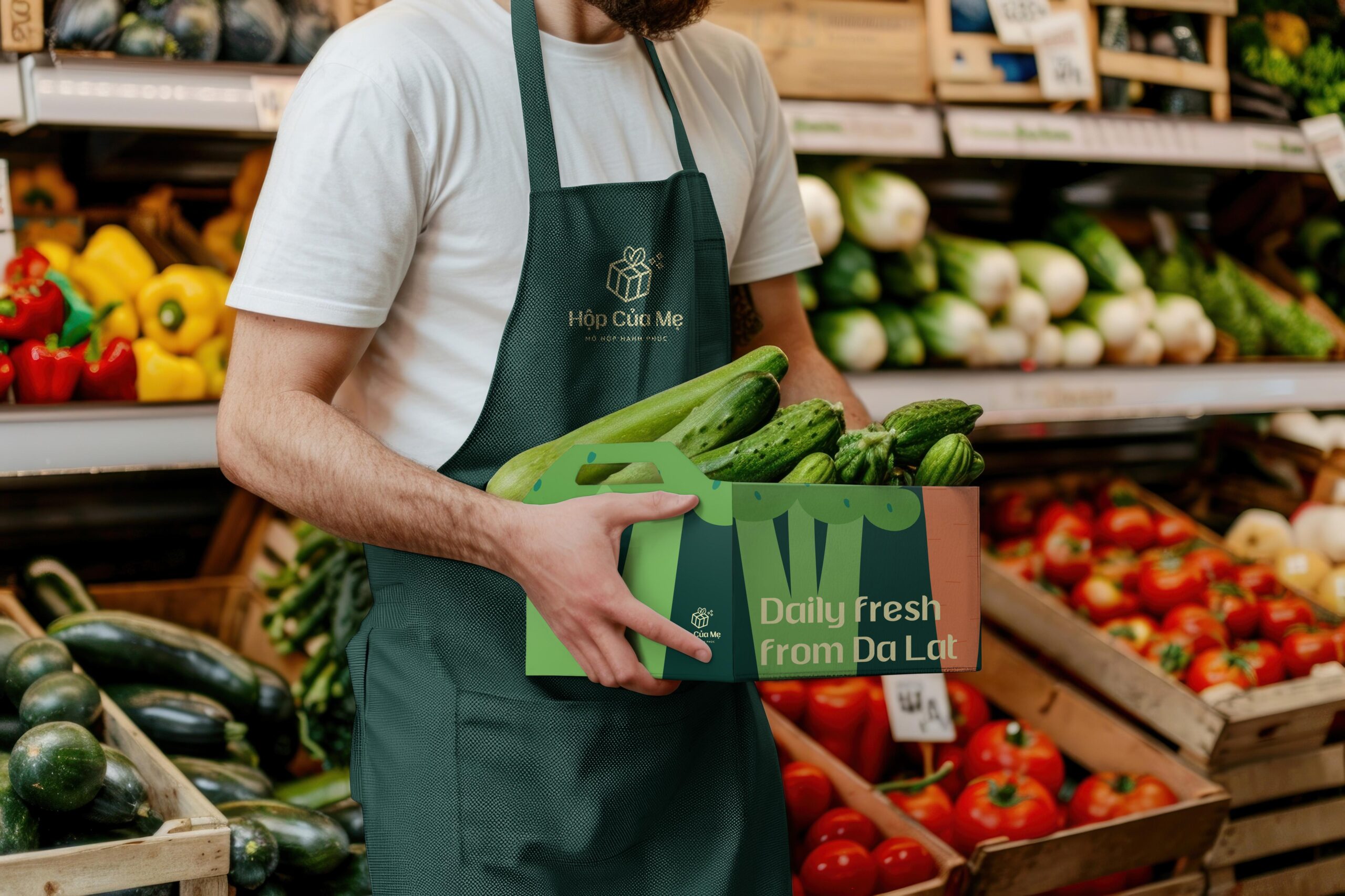
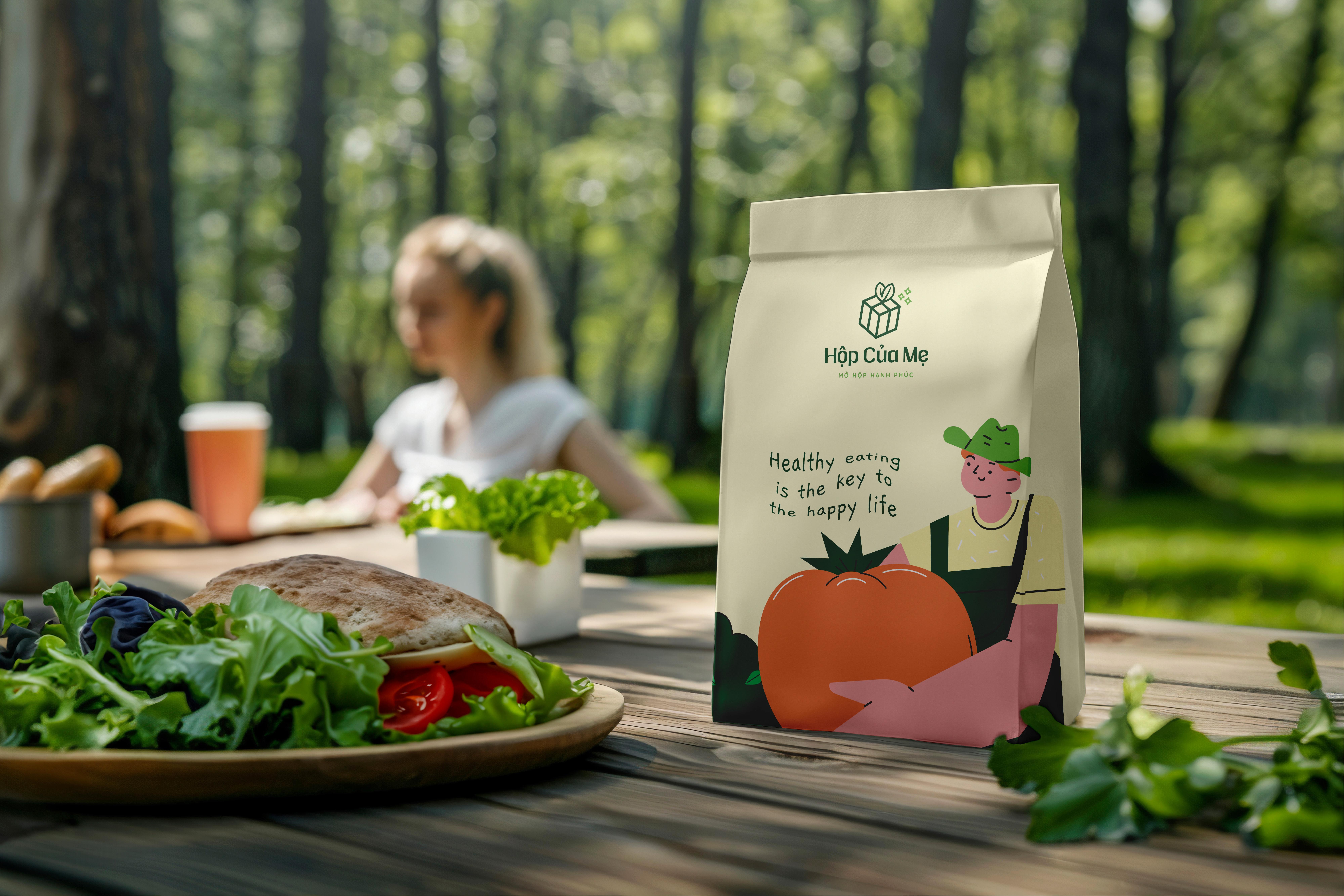
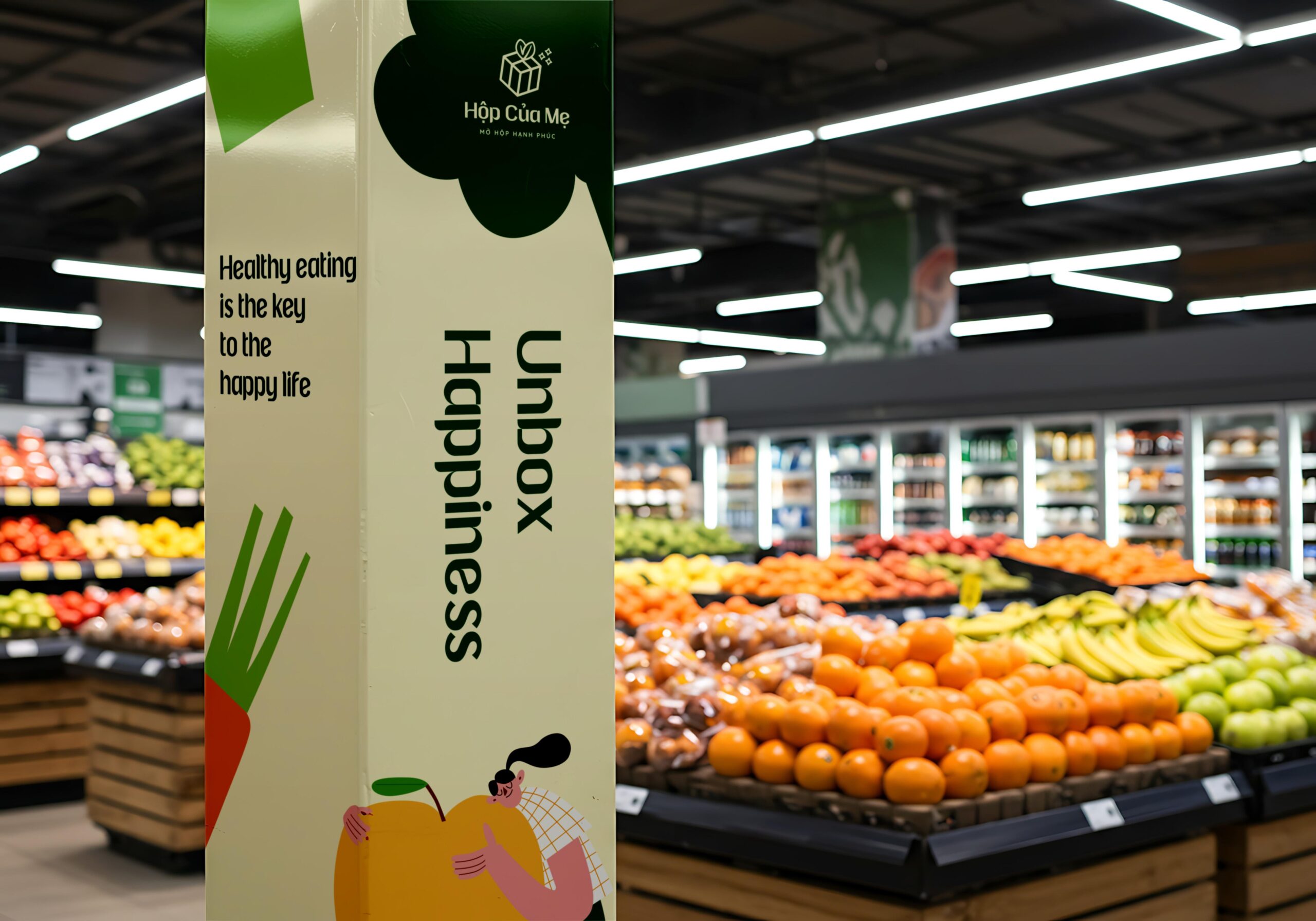
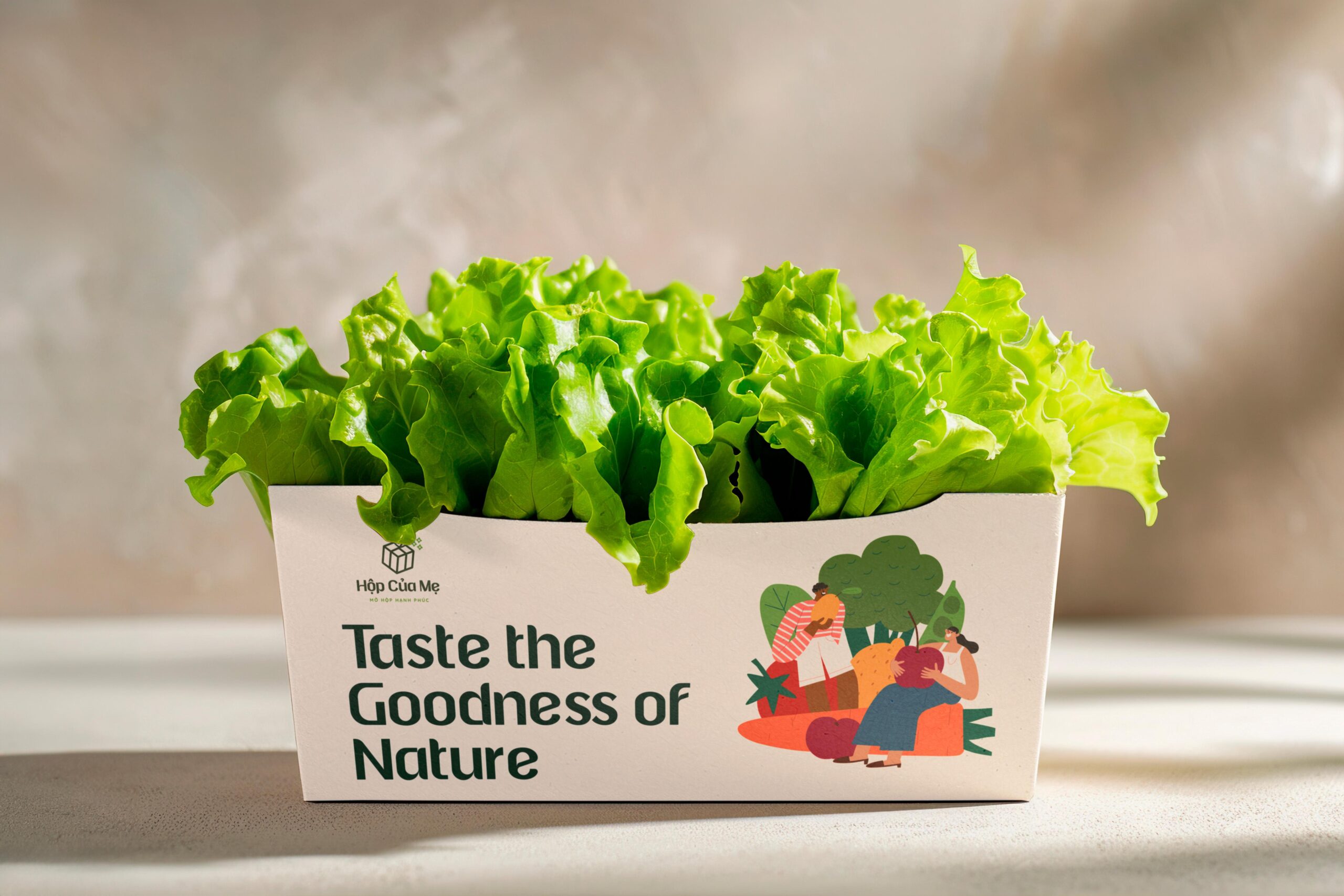
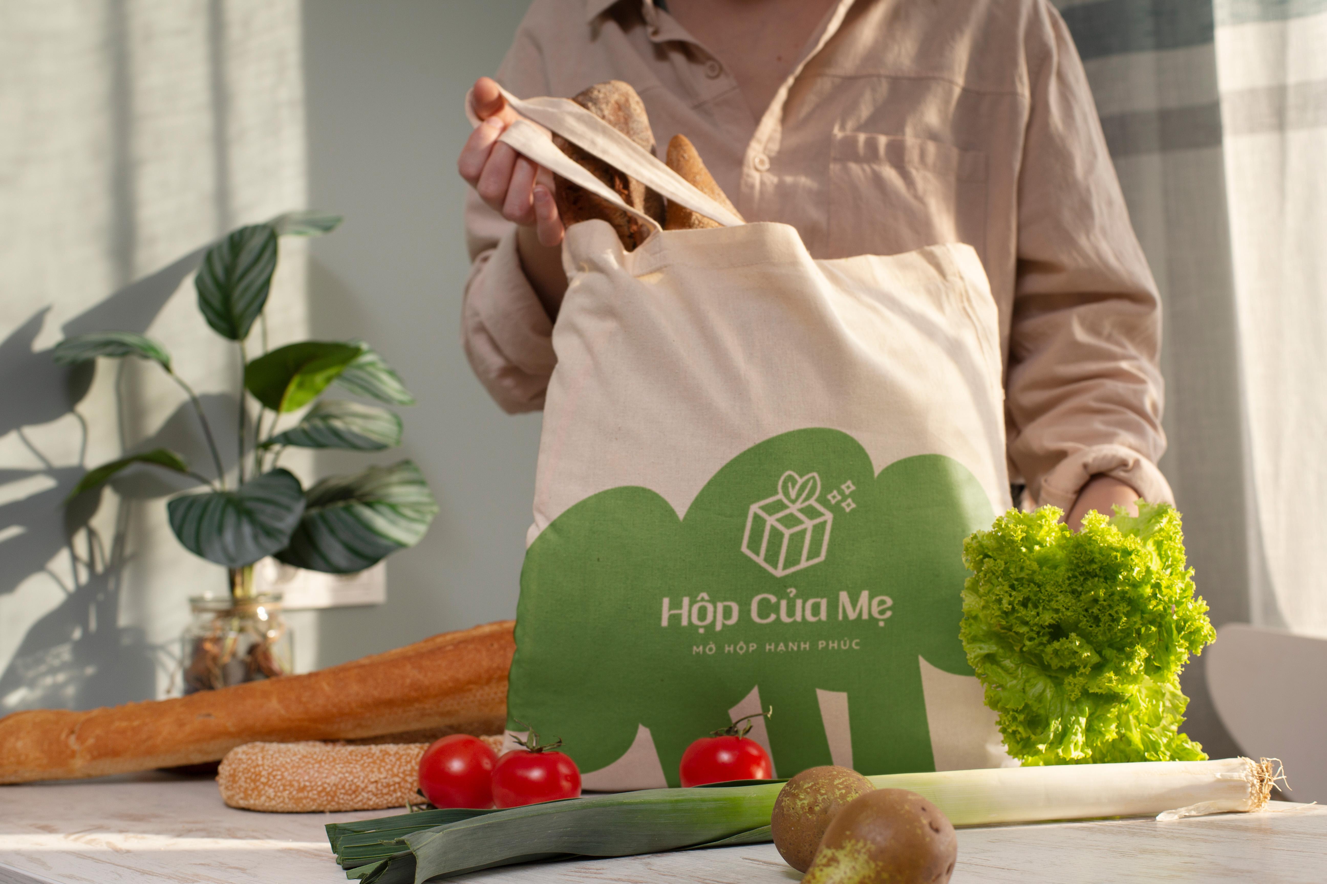
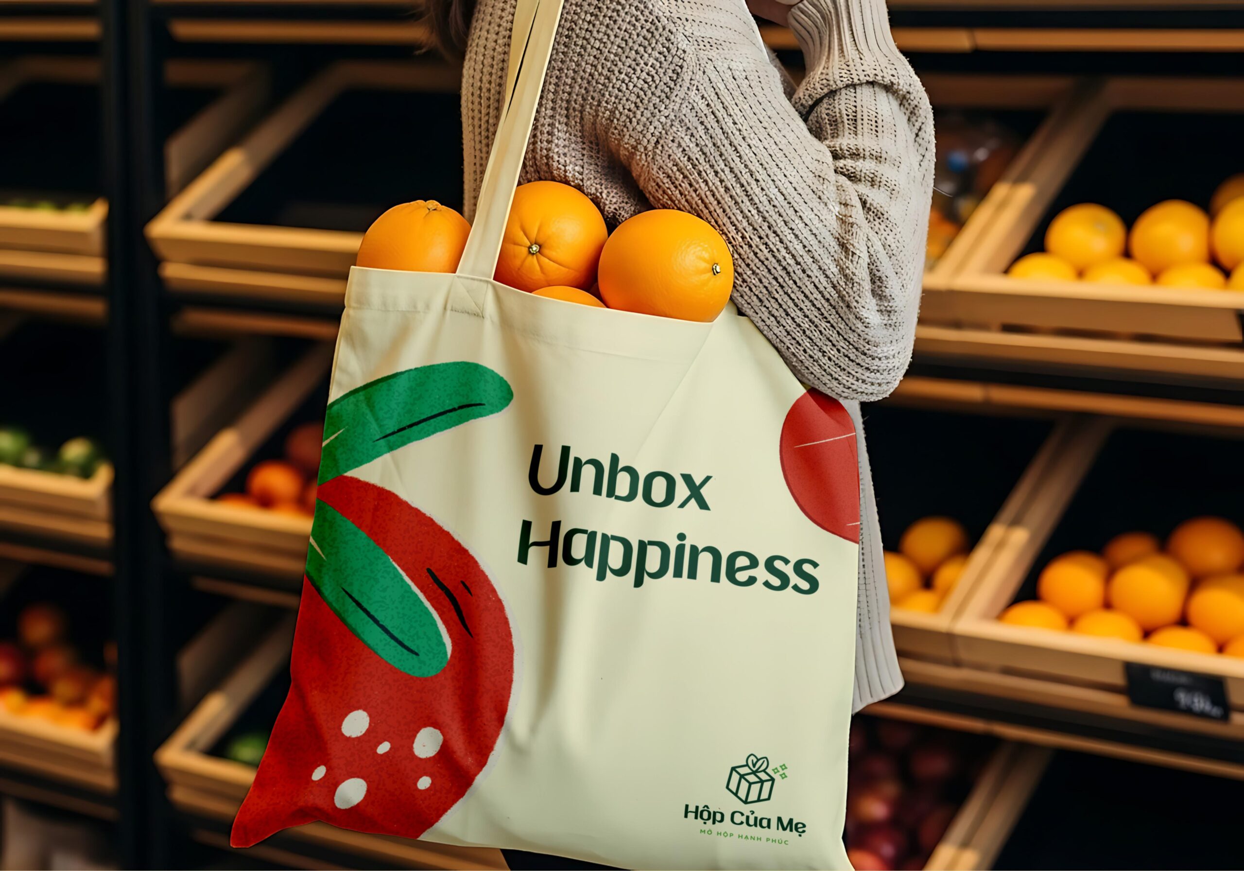
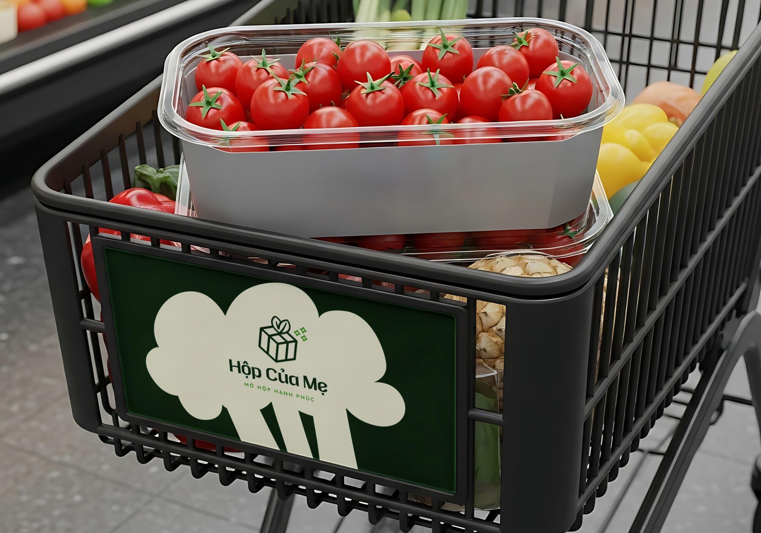
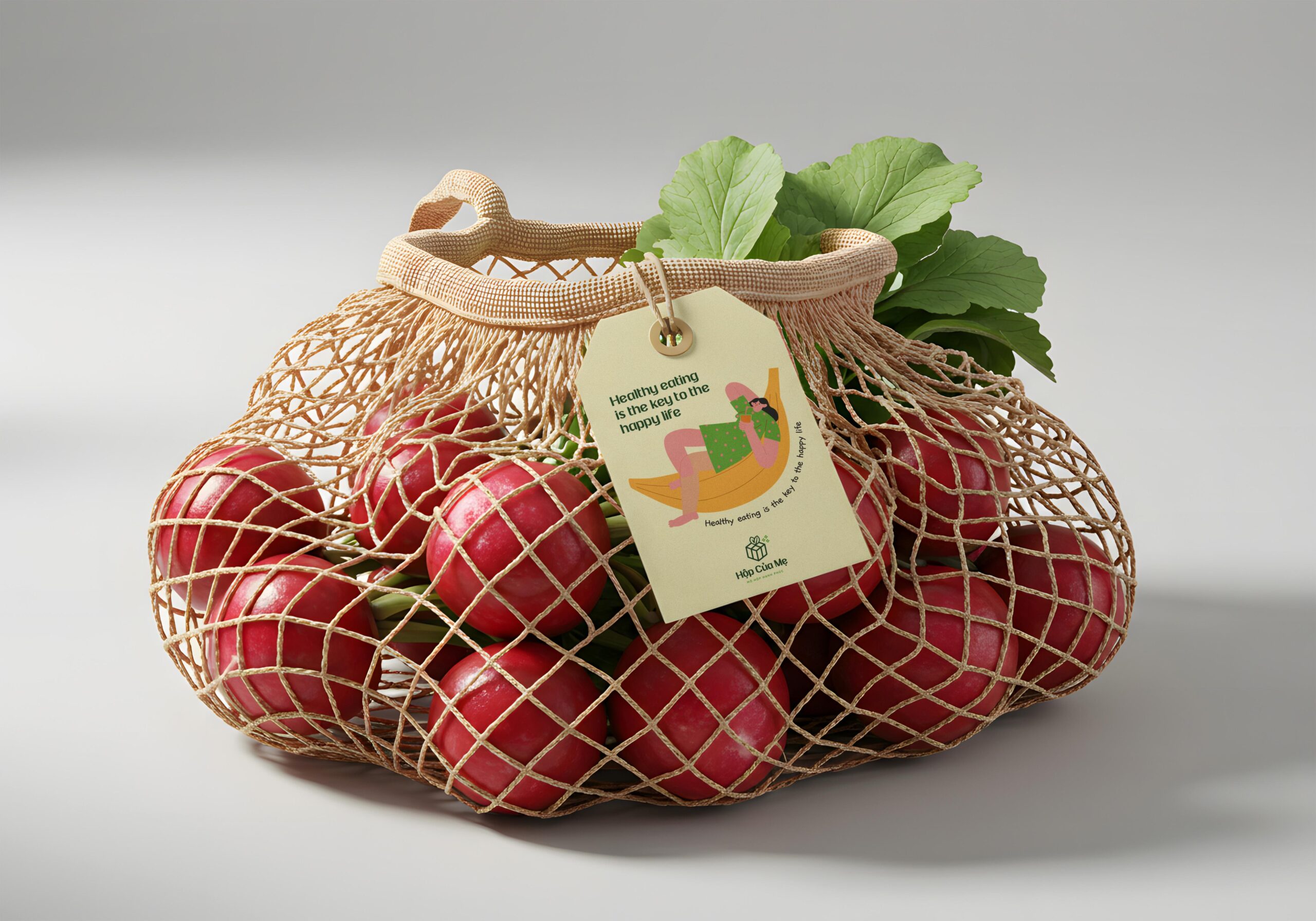
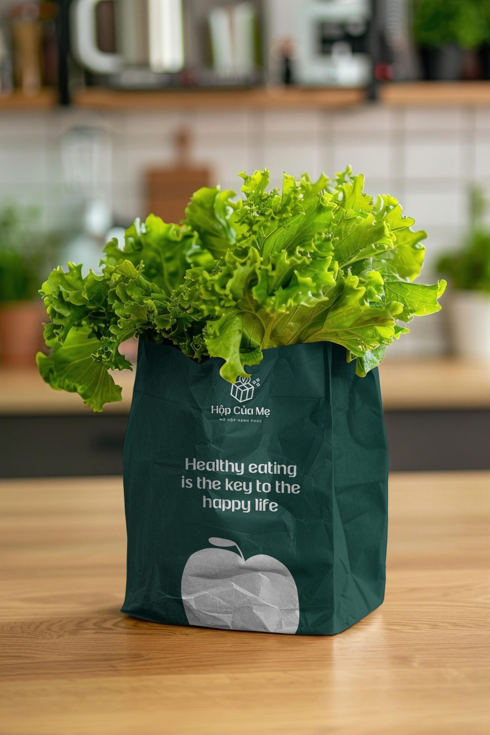
The logo concept for Hộp Của Mẹ speaks about love and a touch of everyday magic.
It features a glowing gift box sprinkled with stars, wrapped with a ribbon shaped like a leaf — a poetic symbol of freshness and care, as if every box is filled with nature’s happiness.
It features a glowing gift box sprinkled with stars, wrapped with a ribbon shaped like a leaf — a poetic symbol of freshness and care, as if every box is filled with nature’s happiness.
The wordmark uses a gentle sans-serif typeface with soft curves at the letter tails, creating a sense of warmth and friendliness.
This detail connects to the brand’s core values of kindness, freshness, and natural goodness, reflecting a business that delivers happiness and smiles through fresh produce.
This detail connects to the brand’s core values of kindness, freshness, and natural goodness, reflecting a business that delivers happiness and smiles through fresh produce.
Client: Hộp Của Mẹ
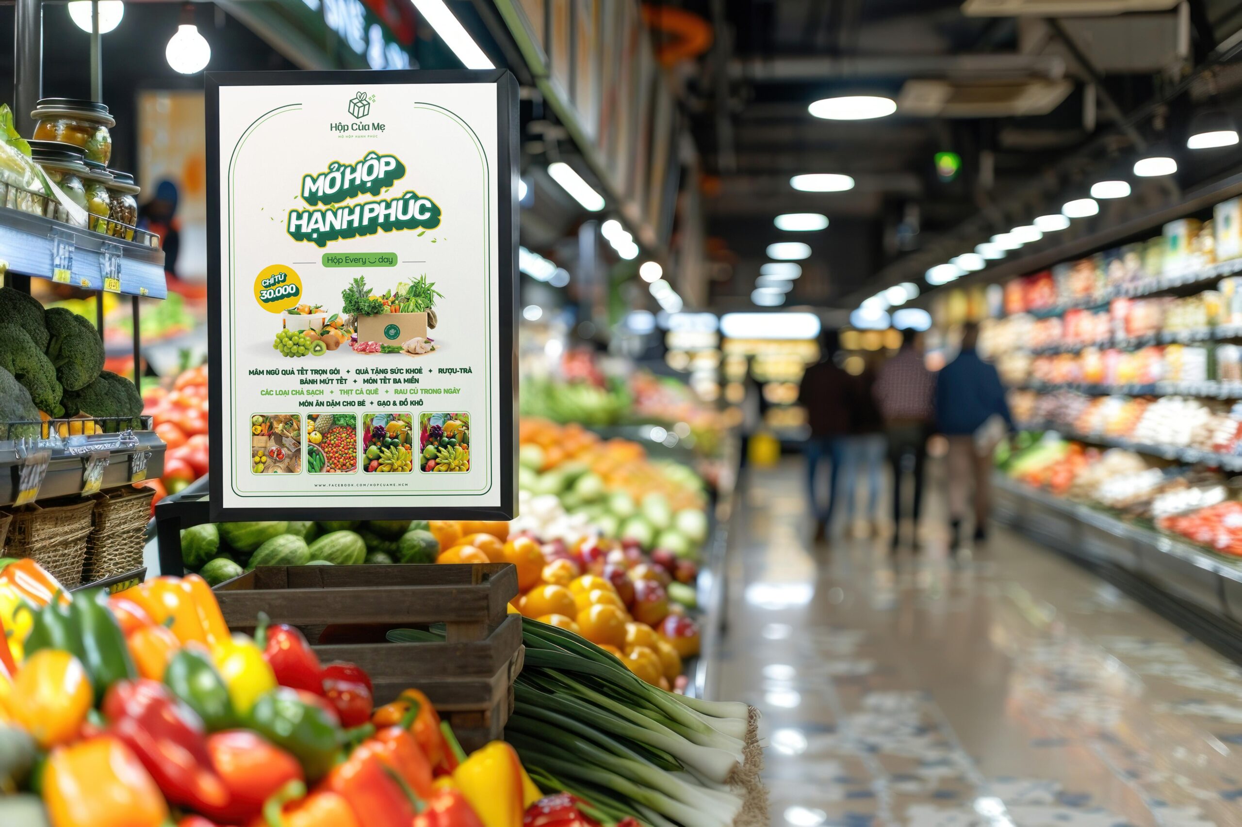
Sector: Grocery Store
Country: Da Nang, Viet Nam
Discipline: Visual Identity, Packaging Design
Art Direction: Junz Nguyen
Design: Junz Nguyen
Sector: Grocery Store
Country: Da Nang, Viet Nam
Discipline: Visual Identity, Packaging Design
Art Direction: Junz Nguyen
Design: Junz Nguyen
Got something on your mind? Talk to me!
© 2017 - 2025 Junz Nguyen Collective
All content on this website is the property of ©Junz Nguyen Collective. Reproduction, use, or modification is prohibited unless explicitly authorized by a formal agreement between both parties. All rights reserved.